Visual Design| Best Guide for Beginners
Visual design can be one of the most essential parts of your website. Click on this blog to learn more about the concepts and principles of the visual designs.
Visual design plays a significant role in the overall user experience. The font, layout, and graphics initially get the online audience’s attention. With visuals, blog posts become easier to assimilate and comprehend.
Visual design can be one of the essential parts of your website. Customers make quick judgments about your brand based on how it looks. Visual design is every bit as important as text and functionality because it’s what draws people in. In this blog post, let us show you how visual design aims to create one cohesive website that people enjoy visiting.
What Is Visual Design?
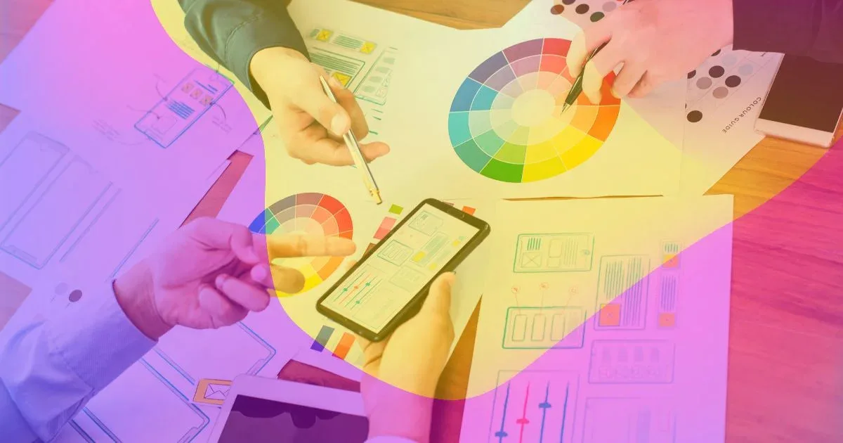
Visual Design is creating a visual representation of your brand, product, or service. It’s the art of communicating your message through colors and shapes. It involves choosing color palettes, fonts, and other visual elements used in a product.
Visual design is an integral part of what makes a product attractive. It can be the difference between a user feel like they’re using an app created by professionals or an app made by amateurs. Visual design is also essential because it helps users understand how to use your product. For example, if you want users to take action on something in your app, you need to make it obvious how they should do that, and visual design can help with that.
Basic Elements of Visual Design
What are the essential elements of visual design? If you are new to graphic design, this may seem like an odd question. After all, aren’t all designs made up of shapes, lines, and colors?
In short: no. While these elements are certainly a big part of most designs, they are not the whole story. To truly understand how visual design works, it is crucial to understand what makes up a good design and what makes up a bad one.
Here are six essential elements of visual design:
- Lines
- Shapes
- Color Palette
- Texture
- Typography
- Form
1) Lines
Lines are one of the essential elements of visual design. They can be used in a variety of ways and can be used to create an effect that you want to achieve. There are many lines, but there are three main types: straight, curved, and angled.
The most common type is straight lines. These lines can be used in various ways, but they usually connect two points on an object or design.
2) Shapes
Shapes can help draw attention to some aspects of a design or make them stand out from the rest of the page. Experiment with different shapes and sizes to see what works best for your project!
3) Color Palette
The color palette is one of the essential elements in any design, and it’s something you should think about early on in the process. Choosing appropriate colors for your audience and the message you’re trying to convey is essential. In a color palette, there are always three colors:
- The main color
- The secondary color
- The accent color
The Main Color should be used as a dominant color across all of your designs. It should also be used as a background on which other elements are placed.
The Accent Color should be used sparingly to highlight certain design features or draw attention to important information.
The Secondary Color can be used in place of any other color in the palette and has no specific purpose or meaning.
4) Texture
Texture is essential in visual design because it helps to make objects feel real and believable. You can use texture to create an object that looks more 3D, like adding bumps and grooves to a box, so it seems like it’s made from wood instead of cardboard. Texture can also make things look softer, like fur on an animal or hair on a person’s head.
5) Typography
Typography is the art and technique of arranging, selecting and sizing the type used to compose a written document.
It includes,
- The font family,
- Point size,
- Line length, and
- Leading (space between lines).
Typography can draw attention to areas of a document or message with different styles and sizes. Typography can also create a design’s overall mood or atmosphere by using different colors, fonts, weights, and sizes.
6) Form
The form is how the elements of design are arranged. It is determined by the shape and size of the elements, their relationship to each other, and their proximity or distance from each other. The form can be seen as a grouping of visual elements into an overall design pattern.
The form can be broken down into three basic categories:
- Abstract
- Geometric
- Organic
The Abstract Form
The abstract form is based on geometric shapes like triangles, squares, rectangles, circles, etc. These forms are often used in logos and simple designs because they are easy to create with straight lines and simple shapes.
Abstract forms can also be more complex than just one shape; for example, a logo might include multiple overlapping conditions that create new patterns within themselves (such as a starburst).
The Geometric Form
The geometric form is very structured, with straight lines and sharp corners. Geometric forms can also be broken into smaller groups called modules (or units). Modules are defined by how they fit together to make up larger shapes; they are usually made up of either straight lines or curved lines (or both). Modules may also contain other modules, such as circles within rectangles or squares within rectangles (like how a clock face has hour marks inside it).
The Organic Form
The organic form is a design principle that arises from how things are naturally made, built on interdependence and interconnectedness. It’s about bringing individual parts together to create something whole rather than focusing on one piece at a time.
The organic form helps you create a sense of unity in your work, which makes it feel more cohesive and meaningful. This can help make your audience feel more connected to what you’re trying to communicate.
Related: Various Types of Website Designs and Their Primary Functions
Principles for Creating a Visual Design
You must follow a set of visual design elements and principles to achieve your required visual design. Together, these design concepts can produce an object that is visually beautiful and enhances user experience. Here is a list of 7 principles for creating a visual design:
- Unity
- Gestalt
- Space
- Hierarchy
- Balance
- Contrast
- Scale
- Dominance
- Similarity
1) Unity
The first principle is unity. This means that your design should have a cohesive look and feel that ties it together. An excellent way to do this is by sticking a color palette throughout the piece. This helps keep things organized and makes it easier for the viewer to follow along as they read.
2) Gestalt
The second step in creating a visual design is understanding the principles that make up the foundations of good design. These are known as Gestalt Principles, used worldwide by designers and artists to create visually appealing works of art. The underlying concept behind these principles is that humans perceive things based on how they look and fit together rather than all at once.
The Gestalt Principles are not rules or laws that must be followed; they’re just guidelines that help you create better designs. If you want to break them, go right ahead! Just be aware that breaking one of these principles may cause you to lose some viewers because their eyes will be drawn where they shouldn’t be or won’t find what they’re looking for.
3) Space

Space is another fundamental element of visual design. It can help create a sense of balance or tension in a piece of work, depending on which elements are placed on the page (or screen).
When designing a visual design, there are a few principles to remember.
- The Rule of Thirds: The idea that dividing the frame into thirds vertically and horizontally creates an invisible grid. This will help you position your elements more effectively and make them look appealing.
- The Golden Ratio: States that elements should be positioned according to how much space they take up and what proportion of the whole they represent.
- Repetition: This means creating patterns with elements so that they flow together nicely. This can be done through color or lighting, or even shape.
4) Hierarchy
Hierarchy is the order of importance of elements in your design. To make your visual design easy to understand, you must create a hierarchy of information. The essential thing should be at the top, and the least important should be at the bottom. The best way to do this is through size, color, or position.
5) Balance
Balance is all about creating a visual design that gives the viewer a sense of equilibrium, achieved by ensuring that the elements on each side of the page are equal in size, color, and value. A balanced composition will feel stable and calm, while an unbalanced one may seem disorganized or confusing.
Balance can be achieved by considering how much space each element takes up onscreen versus how much room there is available for other elements onscreen at any given time (i.e., using whitespace effectively).
6) Contrast
Contrast is the difference between two or more elements. It can be visual or perceptual.
The purpose of contrast is to create an exciting and engaging experience for your users and help them understand what they’re looking at. Contrast helps them distinguish between different elements on your page and makes it easier for them to identify what’s important.
There are several types of contrasts you can use when creating your visual design:
- Color contrast – The use of color to make one or more objects stand out from others in a way that’s clear, easy to read, and aesthetically pleasing; this includes both lightness/darkness (brightness) and hue differences.
- Size contrast – The use of larger/smaller sizes to make one or more objects stand out from others in a way that’s clear, easy to read, and aesthetically pleasing; this includes both height/width changes as well as size variation within an object (for example, a button with smaller text on it).
- Shape contrast – The use of different shapes to make one or more objects stand out.
7) Scale
What does this mean? Well, let’s say you’re designing a poster for an event at your company. If the first thing people see is “COMPANY PARTY!” in big letters and then they have to squint to read the rest, they won’t feel welcome! That’s why it’s essential to ensure that the text on your poster is readable even when small.
There are some simple ways to do this:
- Use a font size (pixels) that will be easily read when printed in small print.
- You should use serif fonts instead of san-serif ones because serifs make letters easier for our eyes to read at smaller sizes.
- Avoid using too many fonts in your design; they can make things hard for readers trying to figure out what all those letters mean!
8) Dominance
Dominance is a principle of visual design that helps to guide the viewer’s eye to important parts of the image. The most common way to use dominance is through contrast. Contrast is basically when things look different from one another. For example, if you have two colors in your image, one will be more dominant than the other because it’s brighter or darker or has more contrast.
Another way to make something look dominant is by putting it in the center of your image and having less important stuff around it. This creates a focal point, which draws attention to itself.
9) Similarity
It’s not always easy to create a visual design that will make your brand stand out. People tend to form groups based on their similarities. So if you want to create a visual design that sticks in their minds, it’s important to have elements of similarity throughout the piece. If your audience is primarily blue-haired punk rockers, then having a lot of red in your design won’t work!
When it comes to visual design, there’s a lot that can be done. You can make the design look like one thing, or you can make it look like something else. You can make it look like anything you want, but that doesn’t mean the visuals will work together well.
- Make sure your visuals are related and consistent.
- Make sure your visuals are cohesive with each other.
- Use the contrast between elements to draw attention to what’s important on each page or screen.
The Role of Visual Design in UX

Visual design is essential; it’s practically a requirement for all UX designers.
Having a good idea is not enough; you must know how to communicate it effectively. For your idea to be understood by the people who will use it and make decisions about its future, you need to explain it clearly and effectively. This is where visual design comes in: It can help you move your ideas from your head into the physical world, where they can be seen and examined by others.
Visual design helps you tell a story with your product. When designing something, think about what story you want it to convey and how it relates to the user or customer interacting with it. Do they see themselves in this product? Does this product help them feel more confident or booming? What is the message that each element of the design sends out?
Good visual design helps people understand what they’re looking at faster than text alone can.
Related: Top 20 Best Design Systems for Products & Their Features
Usability vs Visual Design: What Is More Important?
There’s a lot of debate about this topic, and it can be difficult to know what to prioritize when you’re trying to build a website or app. The answer depends on your audience and your goals for the project.
Here are some questions to ask yourself when considering whether usability or visual design should take precedence:
1) Who Is My Audience?
If you’re building a site for kids, you might want to focus on making sure the site is easy to navigate, whereas if you’re building an app for adults, you might want to focus on making sure it looks good.
2) What Do They Want?
If they need something simple and elegant, it’s better to emphasize usability over aesthetics. But if they want something flashy and over-the-top, they might prefer an eye-catching design over usability.
3) What Will Set My Product Apart From Others?
Suppose you’re trying to stand out in an oversaturated market and catch people’s attention with something unique or exciting about your product. In that case, visual design may be more important than usability (but not always).
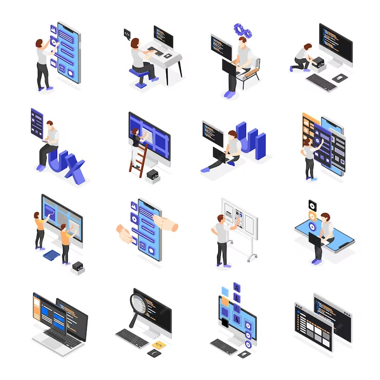
Who Are Visual Designers, and What Do They Do?
Visual designers are the people who bring your ideas to life. They use color, texture, and shape to create a world you can enjoy. They’re the ones who make sure your app or website looks beautiful but also works well for users.
They collaborate with other designers to create a cohesive look and feel for your brand. They’re also responsible for ensuring that each element on your website or app is legible and works well together.
Related: How To Get A UX Design Job With No Industry Experience
How Visual Designers Can Create a Positive User Experience?

Visual designers can create a positive user experience by ensuring their product’s design is intuitive and easy to use. Here is a step-by-step guide for all the visual designers out there.
Step 1: Make Sure That the Product Is Easy to Navigate
Users don’t want to spend too much time figuring out how to use your product, so you need to make it as easy as possible for them. This means avoiding complex designs and using familiar icons whenever possible.
Step 2: Keep the Interface Simple and Clutter-Free
If there are too many options or buttons on a page, users will get overwhelmed and confused, and they’ll be less likely to stick around or even try your product again.
Step 3: Pay Attention to Color Choice in the Product’s Design
colors play a huge role in determining whether or not people like something! They can also trigger different emotions in users depending on your chosen colors, so keep that in mind when designing your site or app!
Step 4: Clear Visual Hierarchy on Every Page/Screen
A clear visual hierarchy is essential in any design, but it’s especially important in web and app design. When you’re using your phone or computer to interact with something, you don’t want to think about where you’re going or what’s necessary; you want to be able to click around and find what you need immediately.
The best way to do this is by ensuring that the most important elements are visible and that everything else fades into the background. This means that the main navigation should be easy to find and easily accessible; the main content should be clear and readable, and anything less critical should be tucked away into a secondary menu or sidebar.
Step 5: Strive for Consistent Design
To ensure your visual design is on point, you must ensure that it matches what you’re trying to achieve with the rest of your product.
The most important thing for visual designers is design consistency. Consistency in how things look and feel, consistency in how users interact with those things, and consistency across platforms (desktop vs mobile). If you lack consistency, users will feel disoriented and confused when using your product or service.
Step 6: Be Careful With Trends
Visual designers have a significant impact on the user experience of a product. They’re the people who create a product’s look and feel, from the colors and fonts to the layouts and overall design of screens.
One of the biggest mistakes visual designers make is following trends instead of using good judgment. If you want your product to stand out from the crowd, don’t just follow what everyone else is doing!
Step 7: Test Visual Concepts
The visual designer’s role is to create a positive user experience by testing visual concepts that are intuitive, easy to understand, and aesthetically pleasing. This means that you must be able to communicate effectively with other members of the visual design team to ensure that your designs meet the needs of users and stakeholders.
How Can Design Help Your Business Perform Better?
Design is everywhere.
It’s in our homes, on the road, and on our phones. Design can make or break how we feel about a product, from how a website looks to how a car looks. So why should your business be any different?
Design is more than just a pretty face; it can help your business perform better by improving engagement and conversions, increasing brand awareness and recognition, and even improving efficiency. Here are some of the ways that design can help your business do better:
Related: Role of Visual Design in User Experience
1) Help You Connect With Your Audience on a Deeper Level

Design can also help you connect with your audience on a deeper level. If your product or service has a vital design element, incorporating that into your website helps people feel connected to it before they realize what it does for them. This helps to build trust between you and your customer base because their expectations are set before they ever contact you directly!
2) Better Customer Satisfaction
Designing for performance means considering everything from color palettes to typography choices so that all aspects of your business experience are unified in one cohesive package, which ultimately translates into better consumer satisfaction!
3) Improve Engagement
We’ve all heard the saying, “beauty is in the eye of the beholder”. It’s true, but beauty also has much to do with how we feel. It can make us feel calm, happy, or even energized. This is especially true when it comes to websites and apps. Design matters!
When you create a website or app, you create an experience for your users. If that experience is clunky or confusing, users won’t stick around long enough to find out what else your business has to offer, and that’s bad for business. They’ll leave feeling frustrated and annoyed about wasting their time on something that didn’t seem worthwhile.
But if a user encounters design elements that are intuitive and easy to use, they’ll be more likely to explore more features of your site or app and maybe even come back later when they have more questions. The point is this: better design leads to better customer engagement.
4) Improve Conversions
You’ve probably heard this: people don’t buy products; they buy experiences. This means that if you want to make sales, it’s not enough for visitors to feel good about themselves when they’re on your site; they have to feel like they’re getting something out of it too. Design is one way to provide an experience that makes people feel like they’re getting something out of their visit, which can lead them down the path toward making a purchase.
The design of your website can have a significant impact on how many people convert and become customers. If you’re looking to improve your conversion rate, it’s essential first to understand the factors that can negatively impact it, then work on fixing those issues.
5) Increase Brand Awareness and Recognition
If you’re not getting noticed, it’s hard to get customers or clients to buy from you. Design helps people see your brand and recognize it in their minds when they see it on the street or online. And once they recognize your brand, they know that if they see something with your logo, it will probably be good quality. This means that when you are seen as a brand, you’ll be seen as a leader in your industry. When people see that leadership, they trust what your company does and will often want to try it for themselves.
6) Improve Efficiency
The most important thing to remember when designing your business is to be efficient. You want to ensure that everything you do as a company makes sense and contributes to the bottom line. This can be incredibly challenging when dealing with visual design because this type of design doesn’t always have a noticeable impact on the performance of a business.
How Much Money Do Visual Designers Make?

Visual designers in the United States earn an estimated $74,508 in total compensation annually, with an average salary of $69,137, according to a survey by GlassDoor. This number can vary depending on what type of work you do and where you live, and other factors like experience level or education level.
Bottom Line
In many ways, the design in our world will always be tied to practicality and the physical world that surrounds us. The visual design may not have actual physical property, but it certainly has a spatial one. This makes sense; after all, we created a visual design to supplement the (mostly) physical objects around us in the first place. And if these objects are more prevalent in our lives than ever, it only makes sense for visual design to reinforce this bond.
Take the advice in this article on board, consider how to apply it to your efforts, and get started. Everything else will come naturally from there.