Design Consistency Guide: Best Practices for UI and UX
Here are the best practices for top-notch UX/UI. Learn to optimize interfaces, avoid clutter, and prioritize user clarity. Click on this blog now.

The term “user experience” refers to a large field of study. Anyone who works in UX design must be knowledgeable in a variety of subjects. Although it is difficult to condense all of the relevant information in a central post, it is feasible to emphasize the most significant guidelines that any UX designer must follow in order to provide a user experience best practices.
What is User experiences(UX)?
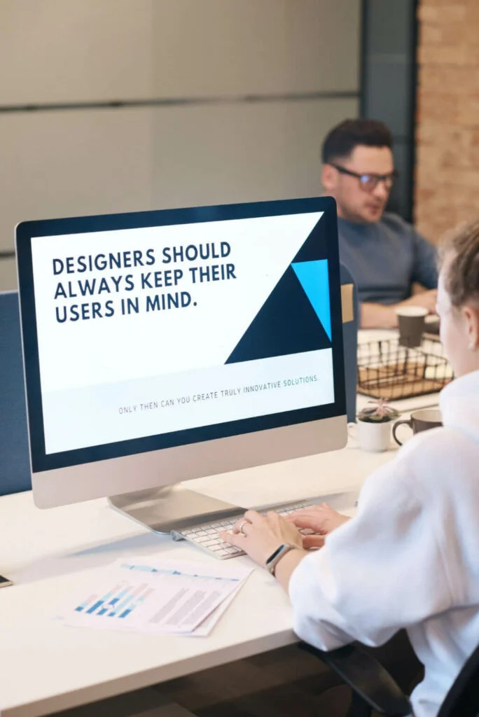
The process by which designer teams develop products that give users relevant and interesting experiences is known as user experience (UX) design. This includes features of branding, design, usability, and function, as well as the full process of obtaining and implementing the product.
23 Top-Notch Strategies for User experiences(UX) Best Practices
This set of best practices is intended to help UX Designers consider how much they can contribute to the development of an application. Here are 15 key design rules that each and every designer should know for UX best practices.
1. Don’t try to fit everything onto one screen
Integrating most of the app’s options, functions, and buttons on one screen is a poor UX approach, but it’s one this is all too prevalent. In this circumstance, UX Designers’ team begins with a simple interface and gradually adds features, resulting in a screen cluttered with buttons control.
Below are some of the arguments for placing all of it on one screen:
- An overview is generated
- Fewer clicks are required
- Users despise scrolling
This type of app appears to a UX Designer as a Swiss Army knife having all of the capabilities unfolded, but just the bottle opener is utilized.
1.1 Design Shouldn’t Be Overwhelming
While it may appear that putting all of your application’s options solely on a single screen gives you a better perspective, your mind could only retain nine alternatives at a time. Furthermore, let’s face it, your application’s end-user may not utilize 90% of those buttons very often. Therefore there’s no necessity to overload them.
1.2 Set priorities Proximity to see
Controls should be placed near the data they affect. This indicates that having lesser buttons on a single screen increases visual proximity.
1.3 Users, keep in mind that they do not despise scrolling!
The “users despise scrolling” argument is frequently a result of an inability to offer the relevant context at the appropriate moment toward an end-user. To assist build context, the remedy is to cram as much detail as appropriate into one screen.
The problem here isn’t the necessity to scroll but rather the amount of data on the screen. Putting additional information upward on the webpage doesn’t guarantee that its end-user would absorb it. They may get dissatisfied with your application and leave.
“Do you know? A bug is usually a cause of mild (or considerable) discomfort. Bugs can sometimes be so serious that we have to quit using a piece of software entirely. Read More: How to reduce bugs in software”
2. Don’t overload drop-down menus with options
The following are some of the most common reasoning for implementing drop-down lists and filling them with options:
- There would be higher emphasis and a little less distraction
- The end-user will indeed be able to locate everything they desire more easily
The tips below will help you think about what you need to think about while creating drop-down menus.
2.1 Emphasize Balance
Consider your user interface to be a physical area. Consider the case below: If an item you require is stored in a series of drawers, you must begin opening the drawers until you locate it.
You can locate whatever you need very rapidly if somehow the drawers remain in the appropriate position and are sorted logically. However, if the drawers contain miscellaneous items that don’t really fit the setting of what you require, you will waste a lot of time seeking the correct item.
A good sense of balance can go a far way. The frequency with which an item is used influences where it must be placed in a drawer, this translates to the frequency with which a click is used to define where it should be placed in a drop-down list.
3. Make it clear to the user
Whenever your app seems to have a uniform design system of brand approach, your end-user might notice that almost all pages probably appear the same. Eventually, the end-user might experience as if they’re traveling across a forest on web pages, unsure whether they’ve seen a specific page before or whether they’re on a new page with identical conditions.
The following are some of the grounds for utilizing a very identical system design with brand style:
- A visual style must be completely consistent and thoroughly branded.”
- “Design systems are the driving force behind the design.”
- “We want to make the most of our screen real estate.”
The instructions below explain how to notify the customer wherever they are in your application.
3.1 Design for Distracted Users
Consider an end-user during a Friday afternoon who is jumping between social media, talks with coworkers, private messaging, and genuine work. What URL they recently selected and when users are in the rhythm of the app remain the last things on their minds.
Follow these rules to create each webpage for this user:
- Give each page a distinct header title.
- If your design seems to have at least 1 level, use crumbs.
- Describe the process if the webpage flow contains more than one.
“A content management system (CMS) enables you to create a website without writing any code. Read More: How To Choose CMS.”
4. Long queues and small text should be avoided
Another example of striving to grab the best out of your screen is composing long lines of content and using tiny text sizes. Some of the arguments for this type of design have already been mentioned:
- “Scrolling is something that users despise.”
- “We want to make the most of our screen space.”
The rule of thumb would be to compose no and over nine words in each line when it comes to website design. Whenever a user finishes studying a line, the eyes must be able to move on to the following line. As a result, if a column is excessively long, the eyes have a difficult time moving on.
4.1. Whitespace Doesn’t Have to Be Wasted
Imagine Medium.com, a major blogging network. Have anyone ever observed how much space they “squander” on the screen? It’s because whatever you would think of as “waste” is really a wise investment. It gives the sense that when you really can afford to devote that considerable space to a webpage, the content must be significant.
“A software development plan would be one of your primary papers for years. You may even use the same techniques for other projects and products. Read More: How To Plan Software Project“
5. Do not use two pop-ups at the same time.
Has anyone ever touched a link in a smartphone app to display a notice pop-up screen, only to find another icon directing to some other pop-up window inside that notice?
The following is the major justification for a UX Designer to incorporate anything like it:
- “The user would have greater context awareness.”
Furthermore, the disadvantage of creating a design would be that the end-user would lose track of wherever they were in the application’s or process’s cycle. Whether they dismiss the secondary pop-up window and revert to the very first pop-up session or back to the main screen, users will become more disturbed.
5.1 Avoid having too several pop-up windows open at the same time.
Implementing one of the approaches mentioned above is the recommended practice here:
- Make the very first pop-up window a webpage in and of itself
- During the first pop-up screen, transform the second pop-up screen into an inbuilt text.
6. Place your cards face down on the table.
Cards are currently popular in the UX field. Individual cards are wonderful, but how about a card that contains a sequence of cards?
The preceding is a justification for adopting such a design:
- To create a compelling structure, the cards are layered.
Visible hierarchy is the manner items are grouped on a screen to indicate their significance to an end-user, which is commonly discussed by Expert Designers. To portray data in a specific way, physical symbolism—like cards—was included within the visible hierarchy.
Since all playing cards in a typical deck are the same size, digitized cards positioned on, underneath, or beside other cards can indicate specific situations and relationships amongst data.
When a card is nestled within another card, the end-mental user’s image of whatever you can accomplish with the cards begins to crumble. This end-user may begin to doubt the relationships between other elements in the UI, jeopardizing the application’s design hierarchy.
6.1. Cards should not be nested.
Rather than nesting cards, arrange them adjacent to one another in your layout (or close to there). Alternatively, arrange these in a belt pattern (like as cards are kept on a casino table).
“UCD is an approach to digital product development and designing that puts actual users at the front of the product creating procedure. Read More: What is UCD and its methodologies?“
7. Make a thorough approach to your forms
A UX Designer must make numerous form-related considerations. Should there be a large list of forms inputs or examples? Might the document be divided into several steps? Perhaps 2-3 columns of forms inputs would be better, allowing everything to fit on a single screen?
The major reason for cramming a lot of forms field onto a single webpage is one we’ve heard previously:
Users despise scrolling
The problem here isn’t the necessity to scroll or search but the amount of data on display (meaning, how many fields are appearing on the screen at one time). The number of input fields, including buttons, must be kept to a bare minimum while providing context with the flexibility of use.
8. Make every button’s function clear
A team of professional Designers must include certain aspects on every page to assist an end-user become oriented when building a sequence of app pages. In a similar vein, you might believe that icons do not require to be uniform since the end-user just has to recognize them in the situation of a specific page.
- “That’s how Apple and Google do it” might be a rationale for unpredictably developing buttons.
Reliability in button design, on the other hand, is critical for a user’s flawless progression throughout your program.
8.1 Position, color, and labeling should all be planned ahead of time.
“Accept” and “Cancel” are two of the most prevalent buttons that confuse. As a UX Designer, users must choose which one goes mostly on the left and which goes on the right in addition to building a clear relationship between both for the end-user. Visitors should also think about the button colors and labeling.
The general rule regarding buttons layout is that once the end-user progresses through an application flow, the icon should look like this:
- It must be on the right-hand side.
- It must be green in color.
- It must be labeled with a description of what it performs (e.g., “Accept,” “Proceed,” or “Order”).
Therefore, this can be problematic when performing “destructive operations,” such as canceling a membership. You’ll be required to decide if the icon label would say “Stop” or “Cancel subscription” in this case.
“A NoSQL JSON directory can store and recover information utilizing the “no SQL” rule. Read More: What are the advantages of NoSQL”
9. UX is not UI
UX is not the same as UI.
The user interface is a component of the overall user experience.
Several designers make the mistake of confusing UX and UI design as though they are the same thing.
Understanding the differences between the two areas is critical, and we went through UX design in-depth in the article How You Really Understand Concerning User Experience. In a nutshell, User Interface refers to the physical area when humans engage with products, whereas User Experience refers to the emotional response to those encounters.
10. Designers are not the ones who make the decisions.
Real-world testing is an important aspect of the design phase.
Designers frequently presume that the individuals who would adopt their interfaces will be similar to themselves.
Consequently, designers put their reactions and behaviors onto their customers. However, it is a mistake to believe that you are your user. In psychological studies, this is known as the false-consensus phenomenon, which is the propensity to think that the individuals reflect our opinions and will act similarly in a particular situation.
11. The user experience design process isn’t fixed in stone
Customize your design method to the product you’re working on.
Several designers assume there is a single universal UX methodology that can be used on any project. However, there is no very thing as both a one-size-fits-all approach to user experience design.
Although individual phases to every project can be defined, a precise UX methodology should generally be chosen depending on project objectives. Each initiative is different and has its unique set of criteria.
“Website maintenance services help you to rank higher on the search engine results page organically. Learn More: What is a Website maintenance services list?”
12. Before you design a genuine product, create a prototype.
A prototype step should be included in the design process for digital products.
Prototyping is the process of making a model of an item in order to evaluate it. You can use prototyping techniques to test your idea before working with an engineering team to construct the final products.
Prototyping can be done using a variety of design methodologies. Rapid prototyping is a valuable prototyping methodology. It’s a common method for fast prototyping a product’s future outcome, whether a site or an application, and verifying it with a set of consumers.
13. Error prevention is preferable to error correction.
Wherever possible, design items to reduce the number of potential faults.
Error is a natural part of life. When humans interact with user interfaces, they frequently make mistakes.
They occasionally occur as a result of user error and occasionally as a result of an app’s failure. Whatever the reason for the issue, how it is handled has a significant influence on the user experience.
Users despise errors, and they despise even more the notion that they were the cause of such conduct. As a result, you should attempt to either completely eradicate error-prone scenarios or analyze them and alert users prior to they take action.
14. While designing, employ real content.
Lorem Ipsum and dummy placeholders should be avoided.
Whether it’s text, photographs, or videos, nearly every product revolves around content. Designing can be thought of as a supplement to content.
However, many designers ignore content throughout the design phase, opting for Lorem Ipsum over real prose and placeholders over realistic graphics. Though having a design may appear attractive on a designer’s artboard, the image may be quite the opposite since the same layout and design are loaded with real data.
Related: Design your “Customised Software” for better business growth.
15. Take Note of User Attitudes
People use social media to discuss their opinions, express their grievances, and compare services in today’s digital era. Giving notice to social media feedback on your service or product is critical, whether it’s for word-of-mouth marketing or emerging competitors.
16. Be aware of your target market.
Within the design phase, user research is a logical initial step.
It should serve as nothing revelation that the audience is among the most crucial variables to evaluate when creating a product. Whenever you wish to create a product that your people will adore, you must first figure out what they need most.
As a result, user analysis should be a critical component of the UX design procedure. Once you begin designing, remember to consider your customers in mind! It will help to rely on advantages rather than features when providing value to customers who would use the product.
17. Voice User Interface
By no terms, voice help (creating exceptional user experiences via voice control) is a fresh UX trend. What’s unique is the way it’s evolving right now. Initially, UX’s special design for speech interfaces was primarily screen-first, which meant that perhaps the screen was 1st and primary point of connection.
Drawback
Voice UX might fall short for a variety of reasons, including getting glitchy, failing to interact with the application, or causing inefficiencies whenever a person must talk, to mention a few.
Voice-First Perspective
Speech interfaces are becoming more critical, and more people use voice programs. Thus there is a greater need to create a seamless interaction between both the user and the speech applications, programs, or software.
That’s why it’s critical to consider the experiences not just through a screen-first perspective, even though a voice-first as well as at the bottom least a fusion of the two.
18. Scrolling User Experiences
Scrolling is a UX action, and it’s becoming increasingly imaginative. The adventure of discovering more and more elements of a website via scrolling is the emphasis of this UX trend. Components in the backdrop change, and elements flow about the webpage with the visitors or people who are fully engrossed in the website’s interaction.
Micro-interactions scrolling
Micro-interactions are subtle visible movements that seem to have a significant impact, ranging from the once innovative “like button” to a scroll bar that indicates where exactly you stand on a page.
Micro-interactions, if they’re a swiping, hover color, animations, or data input, are designed to make the user experience highly interesting, engaging, and pleasurable.
19. Emotive Interaction Design
Emotional design, often known as emotive interface design, is all concerned with developing experiences that elicit an intellectual response from consumers. Users form a stronger bond with the website or app as a result of these interactions and get a more favorable and unforgettable interaction altogether. They accompany the user on their trip and offer support and encouragement.
Pros
Animations, as well as other effects, are used to generate interactions that are similar to human connections. Duolingo, for instance, employs characters who applaud users on their accomplishments, present them with awards and offer assistance when they are unable to complete a task. The event is linked to positive emotions such as excitement.
20. Visualization of data
Data visualization is a crucial aspect of various experiences. However, if done incorrectly, it may be obscure and overpowering. The data visualization UX design trend looks at making the experiences more aesthetically appealing, digestible, and entertaining. Line charts, Bar charts, and pie charts, as well as the use of bright and brilliant colors, are among the most noticeable ways to do this in UX design.
Pros
- Enabling users to browse and extract data utilizing functionalities like dragging and tapping encourages them to interact with it.
- These methods can provide a healthy balance of data to a visitor, from the overall situation to the finer details.
- All users will have a good and interactive experience because of the utilization of contrasting colors and widely available knowledge and data.
Precautions: Even so, you don’t intend to overload consumers with information or allow them to feel as though they don’t comprehend it; this is a specific reason to lose visitors.
21. Storytelling User Experience Or Case Study
It’s no surprise that humans respond to stories. Cave paintings, fairy tales, and all the thoughts and symbols that transcend through time and bring us along in similar narratives prove that storytelling has been among humankind since the beginning of humanity.
Pros
- It’s a social practice that allows people to connect with the story being told.
- At their foundation, these experiences and stories are passionate, elicit curiosity, and are engaging.
- Thinking ahead to 2024, designers see this everlasting technology as an effective UX tool.
- Companies and people can form a strong bond by providing an experience via storytelling.
- How frequently a user understands leading brands or a client’s experience, more the inclined to accept and identify with the company.
All of this information, or plotlines, are woven into the user’s trip and story all through UX. Page by the page, or even with a single scroll, new facts about how this company evolved to be, whatever they’re attempting to do, as well as how the client integrates into the purpose, products, or service emerge.
22. Dark mode UX
Dark mode, in simplest terms, refers to user interfaces having a dark color scheme. Using dark colors for the backdrop, such as black and other dark hues, then reversing the design so that text, as well as secondary features, stand out in light colors.
Dark modes have been utilized in apps like youtube, Apple, and Google over decades, and it’s increasing more of a standard in UX since consumers and many designers equally simply enjoy it.
23. New 3D Design Tools
Many of the UX design ideas on this list have one thing in common: making the user experience better engaging altogether. Of course, this necessitates the employment of innovative, stimulating graphics, such as those created in three dimensions. 3D elements aren’t a new notion in design.
In 2024, it would be the improvement of 3D development tools, not the prevalence of the 3D impact, that will establish it as a UX development worth noting.
Virtual and augmented reality
The revolutionary transition toward augmented and virtual reality has accelerated as a result of COVID-19 prevention measures and Mark Zuckerberg’s Metaverse’s opportune launch. As in result, UX design trends in 2024 will see the development of more realistic, personalized, and distinct substitute playgrounds.
What user experiences will assist in the coming years?
It’s a fantastic moment to be a user experience designer. User experiences are altering substantially to serve both the users and the organization, thanks to AI’s ability to deal with information rapidly and efficiently.
Those trends operate alongside and for the visitors, if it’s introducing excitement and adventures to the webpage via inventive scrolling, data visualization, emotional resonance, or just delivering seamless, smoother, and personalized experiences.
5 Common UX Design Mistakes and How To Avoid Them
It’s tempting to make blunders when designing a product and struggle to resolve consumer wants with specifications. Below are five frequent UX design mistakes that product groups make and ways to minimize them:
1. Unable to develop product decisions based on user feedback
The blunder: forgetting to place the user first is among the most prevalent UX design blunders product managers make. It’s simple to fall into the mistake of thinking you understand what consumers need or want, particularly as you acquire expertise in your position and inside your product—but the issue is that you are not your users.
How to prevent it: proactively acquire user feedback and utilize it to promote product modifications. Use customer input to determine whether or not the improvements and improvements on your market roadmap are needed (or even desired).
2. Redesigning with no specific goal in mind
The blunder: UX design is a continuous, iterative procedure. However, that doesn’t imply you have to rebuild your products on a regular basis fully. Users dislike change, though it helps them in the long run thus, developing and revamping your UX haphazardly is pointless.
How to prevent it: If you would not have a compelling cause to modify things—a clear aim and business model for the design change undertake it. When you require making changes, consider the short and incremental, gathering input through A/B or multiple testing along the way.
“Do you know? You can create free websites for your small business using free website builders, but here are certain limitations. Let’s look at the 22 Best Free website builders and in-depth guide.
Read More: Top 22 Best Free Website Builders For Small Businesses”
3. Failure to test before iterating on designing products
The error: if you believe you realize what users want, you’re unlikely to spend time testing, obtaining feedback, and making improvements.
How to prevent it: Checking and iterating are critical at each and every stage of UX design. However, prototyping is especially vital. It’s critical to evaluate pre-launch modifications to ensure you’re on the appropriate track.
4. Giving too much to users
The blunder: there’s too much data, too many possibilities, too many features… Help to identify too much of something might lead to issues with their experience. This relates to the simple idea we discussed earlier.
How to stay away from it: Cut anything that isn’t absolutely necessary, whether graphics, a button, or functionality. Otherwise, you run the danger of perplexing and overwhelming your users.
5. Separating UX choices from the rest of the product team
The error: you can’t establish a uniform user experience if UX selections are made in silos inside the product group. UX design is a collaborative endeavor involving teams from all over your organization. Establishing uniformity throughout the user experience necessitates a planned effort by teams throughout your entire organization.
How to stay away from it: Marketing, support, design, as well as various teams should collaborate within product teams. Exchange user input and data among teams, cooperate on major UX redesigns, and maintain other teams informed.
Who are the experts in the field of user experience design?
A full-stack designer like Hapy Design comprehends the complete process and therefore can create with a clear understanding of the development side’s constraints and objectives. They can then respond to the nagging issues and provide solutions, keeping the hand-off experience as pleasant as butter.
Although owning such a diverse set of abilities may appear daunting, being a comprehensive designer provides versatility and independence.
Expert designers have the freedom to pick wherever they spend their time or, if appropriate, emphasize one expertise over others.
Conclusion
Building up a website appears simple at first impression. Therefore, in order to provide an outstanding user experience, every single button, text, and image must be carefully examined underneath the scenes.
Whether you’re building a new site or aiming to better an old one, every feature you include must consider the influence on the users. An expert panel discusses the top strategies entrepreneurs can employ to guarantee company websites possess strong user experience (UX) elements.