17 Web Design Mistakes You Should Try to Avoid
Avoid these 17 web design mistakes and learn how to optimize your website for success. Get detailed insights in this blog.

It is common knowledge that a company’s website serves as the central nervous system of its operation. In this day and age of COVID-19, you really need to have a website that is professionally developed if you desire your company to be successful. As a result of the social distance that has been created, an increasing number of prospective consumers are conducting informational searches on the website of the firm.
A website that has been thoughtfully created may assist you in expanding your company by making a favorable impression on prospective clients and encouraging those clients to engage in the behavior that you want them to. However, if you make any of the common blunders in web design, even your greatest efforts might be easily derailed. And even if you receive a lot of advice on how to build your website, there are some things you should avoid doing. But are you aware of the things that you should not do?
To provide you with a competitive advantage, we have compiled a list of the 15 most typical mistakes that other companies make when designing their websites. If you design your website to exclude these elements, you should have greater success in turning visitors into customers.
Related: Top 22 Free Website Builders For Small Businesses
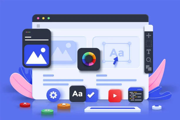
What is Web Design?
The process of organizing, conceiving, and designing the presentation of the content found on the internet is known as web design. The design of a website, as it is practiced today, takes into account not just its appearance but also its total operation. In addition to mobile app design and user interface design, web design includes the creation of online apps. It pertains to website user experience, not software development. Since the mid-2010s, smartphone and tablet browser design have become increasingly essential in web design.
Related: Difference Between Web Design and Web Development
Web designers create a website’s look, layout, and content. Appearance includes colors, font, and pictures. Layout describes how data is organized. A well-designed website is user-friendly, aesthetically attractive, and fits the group of users and brand. Many web pages emphasize simplicity to avoid distracting or confusing readers with excessive information and functionality. The goal of any good web designer should be to create a website that attracts and retains visitors, so it stands to reason that they should take every precaution to ensure that visitors have a pleasant experience there.
Responsive and adaptable design are two prevalent strategies for developing mobile-friendly websites. In adaptive design, information remains in the same place across all screen sizes, but in responsive design, it responds to the user’s device by rearranging itself dynamically. Consistent layout across devices is key to user trust and retention. Responsive design may make it challenging for designers to manage how their work looks. If they’re responsible for the content, they may need to increase their competence, but they’ll have complete control over the final output.
Importance of Web Design
As you rebuild a website, you may ponder its value. How does it affect your business and audience? Here are five justifications for why a good site design is crucial.

Related: Various Types of Website Designs and Their Primary Functions
1) First Impression
Your website is your company’s initial impression. Your business will be judged instantly. You want to wow your audience in these opening seconds.
If your website seems ugly or outdated, your viewers will be turned off. Your website isn’t enticing, therefore they leave. Your page will lose leads to competitors.
Web design affects how people view your brand. You may either keep them on your page to learn more about your business or send them to a rival. The retention of potential customers is aided by a well-designed website.
Related: Various Types of Website Designs and Their Primary Functions
2) It Helps SEO
Web design features and practices affect how you publish material on the website, which influences how spiders from search engines explore and index it.

This is crucial. If the on-page SEO basics are weak, you’ll struggle for exposure.
Certain web design features can affect search engine optimization independently of website content. Your web design code has to be SEO-friendly.
Working with a web design business that provides SEO services as part of its package is the greatest method to guarantee good web design practices (and, in turn, search engine exposure).
3) It Affects Customer Service
Your website shows how you’ll treat others. The design shows how you regard your audience. Your audience understands you won’t help them if you don’t put the effort into your website design.

Your website is a CSR. Bright, sleek, and attractive websites welcome visitors. You’ll appear inviting to website visitors.
An antiquated, unpleasant website makes your firm seem cold and detached. People don’t want to visit a firm that doesn’t regard them.
Your website is your company’s digital face. If someone went into your store, wouldn’t you want to meet them? Modern site design is like a welcoming face greeting visitors.
Related: Top Guide On eCommerce Mobile App Development
4) Builds Audience Trust
Unprofessional websites aren’t trusted. They won’t trust your site if it’s poorly designed or has outdated information. Your outdated web design may make your site look filthy.
Consider someone placing large order with a manufacturer. Because of the high stakes involved, people will go elsewhere if your industrial website design fails to inspire confidence.
Professional websites inspire audience trust. They’ll trust your company and investigate deeper.
Trust your viewers so they stick around. When people stay longer on your site, you get more leads.
5) You’re Competing
Competitors rely on on-site design, therefore it’s important that you do, too. To compete with them, you need to learn web design.
Your website should be unique. Your competitor’s website will rank lower if it’s old, outdated, and low-quality. Your well-designed website outperforms yours.
Your competitors will gain leads. Their engaging page will attract more leads.
Your website’s design may set you apart from competitors. When competing, you provide identical services and prices. Your firm needs a unique selling point.
A well-designed website showcases your company’s distinctive qualities. In doing so, you may demonstrate to your target market why they should select your company above others.
7) Consistency
Branding helps you receive new company leads. You need to build brand recognition so that people will think of you first when they are ready to buy. Web designs assist establish page uniformity.
Each page of your website must adhere to the same standards of fonts, styles, and layouts. Different page designs would make your site appear amateurish. Your audience won’t know what colors to identify with your company, making brand awareness harder.
People will leave your website for a more professional-looking one if it’s inconsistent. Consistency keeps leads on your website and familiarizes them with your business. Redesigning your site for this aspect will increase leads and conversions.
Related: B2B Web Design Trends for 2025: What You Need to Know
17 Common Web Design Mistakes
1) Implementation Without Design-Thinking
Most web designers undervalue design thought and paper layout. Web designers often make this mistake. Designers often “make assumptions” about consumers instead of doing “user research” to better understand customer needs. The website design shouldn’t be approached this way.
To build addictive customer experiences, master design thinking. Design thinking aims to understand consumers’ needs and motivations. Customer-centricity requires empathy for customers, attentiveness to their challenges, and innovative problem-solving.
Design thinking helps designers set goals, assess project scope, build business features, and understand user wants technological capabilities, and solution feasibility and efficiency. All of this helps the designer gather data for sitemaps and wireframes before using any tools.
Without knowing your customers’ demands, you can’t design user-friendly websites. Have empathy for your customers and perform user research to determine their priorities.
2) Not Giving Easy Navigation and Accessibility Priority
Web design blunders result from skipping brainstorming, sitemap, and wireframing. An obvious issue is the menu and navigation structure’s bad configuration. It’s a hassle to scroll through arbitrarily constructed websites with bad navigation. If you’re developing a website with many pages, classify them into sections and arrange them hierarchically to help people navigate.
Device navigation varies. You must pick the proper navigation technique. For mobiles, a hamburger menu works well for navigating on tiny screens. Compare mobile and tablet website navigation.
Accessibility isn’t only about navigation. 300M+ individuals are colorblind, according to research. Most website and user journey designers ignore this. Visual and hearing impairments affect millions. Not considering these users is a typical website design error.
Text size, color contrasts, page titles, picture alternative text, keyboard accessibility, moving and blinking items like carousels, advertising, autoplaying media, scrolling news feed, etc are important for website accessibility. Hypermetropia sufferers may need to zoom on tiny screens. Visually impaired people may prefer listening to reading. Attention-deficit users may interrupt carousels, etc. Good web design considers all things to improve website accessibility. Bad UX may ruin your business.
Related: Benefits Of Creating A Successful Banking Application
3) Not Using A Secure, Adaptive Method Of Design
Although website security is heavily dependent on the technological architecture of the site, it is also, to some extent, tied to the design of the site and the user experiences it provides. The manner in which designers portray the user journeys has a significant impact on the manner in which developers apply the designs. When website security is given priority from the very beginning of the design process, it is possible to close many potential security gaps. For instance, placing the data that is essential to the operation of the business behind verification and payment walls.
In order to provide an omnichannel experience, the design must, in addition to ensuring users’ safety, be responsive and uniform across all browsers and devices. When developing a website, one of the most significant mistakes that can be made in web design is to build distinct user experiences and roadmaps for the various platforms and devices. The emphasis needs to be on making sure that there is as much uniformity as possible across all of the devices. Before you put it into production, it would be preferable if you could test how responsive it is. You may develop responsive websites quickly and easily with the help of tools like LTBrowser, which is offered by LambdaTest.
4) Neglecting Grids and Columns
Web design is evolving quickly, and you must adapt. Some designers still construct designs the traditional way, structuring content with flexbox, breakpoints, float, etc., and disregard the usefulness of CSS grids or guidelines in designing flexible websites. Junior developers believe that they are gone. The idea is wrong. CSS grid, flexbox, and breakpoints, and float are all vital for web designers, and applying them correctly may help prevent grid & column design problems.
With the use of CSS tools, designers may provide a streamlined user experience in which material is neatly divided into sections and arranged in columns and rows. Grid-template-columns, min-max, and autofit eliminate the requirement for media query breakpoints, while grid-template-areas do.
When working with CSS grids, most site designers make the common error of misunderstanding the CSS numbers. In CSS frameworks such as bootstrap, we count columns, whereas, in the system of grids, we calculate lines or stacks. In the grid scheme, lines 1-7 equal 6 columns.
5) Too Much Content Cluttering the Web Design
Too little information risks not delivering the user’s desired result. Too much information can lead to a hard-to-understand,-consume,-and-access solution. Designers might overload users with resources, resulting in a crowded website. Though it’s popular since the beginning, it’s successful. They haven’t updated the website’s look, maybe to retain user continuity. But don’t repeat it.

Not starting with scalable designs is a typical web design error. Many firms redesign their websites for this reason. After a few hundred pages, unstructured, non-templated website designs become difficult to maintain, build, and expand. “Divide and conquer” should be used to prevent design scalability difficulties.
Create distinct web pages for various aspects of the website’s interface, such as the product catalog, product details, user profiles, user activity, etc. Then, break down the various parts of the web page’s interface into smaller, more manageable pieces. Each component should provide one function. Examples include carousels, brief user biographies, product information, reviews, etc. Build the website using these components. This method speeds up and scales website creation.
6) A Failure to Employ a Hierarchical Aesthetics Strategy
Most designers should also avoid failing to strategize the visual order of material, including calls to action. By developing effective visual hierarchies, user journeys may be successfully implemented in a way that is both effective and efficient. This may be accomplished by employing phrases that are attractive, colors that are appealing, images that are appealing, and even minor animations.
Related: How to Make Uber-Like Apps – Create Taxi App
The amount of space between these items as well as the size of these elements may also play a very important role in promoting user engagement. If you do this incorrectly, it will result in fewer interactions with users, which will affect your business’s revenue.
7) Lacking a Clear CTA
Another typical error in website design is a lack of a distinct call to action. In the world of business, a website serves as a kind of pipeline or funnel for advertising and sales. Your website visitor makes their way through the funnel to progress from the stage of prospects to the stage of clients who have been converted. The failure to provide a distinct “call to action” in the proper locations may result in the loss of a significant number of hot prospects. An excessive amount of cold calling might also irritate potential customers.

8) Not Attending To 404 Page Design May Harm SEO
Web design goes beyond layouts and user flows. Wikipedia’s definition includes content and search engine optimization (SEO). Multiple SEO-related website design blunders may be avoided.
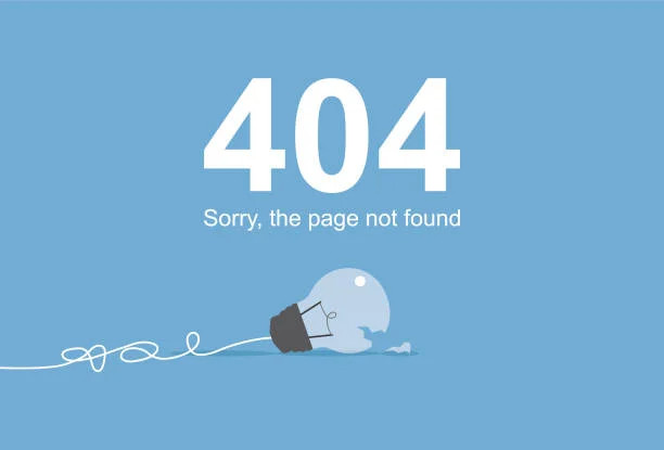
First, not having a bespoke 404-page template is SEO-critical. You can use a customized 404 page or 301 0r 302 redirects to connect to another page. Broken connections hurt a company’s reputation. Users think the website is a fraud and the product/service is subpar. Broken links can be fixed with 302 or 301 redirects. Continuously test, detect, and replace broken external connections.
Not utilizing title & head tags is another SEO-specific design error. The descriptive page content isn’t as effective as a title. Larger fonts won’t help SEO as much as h1, and h2 tags.
9) Badly Organized or Unrelated Images
It may be enticing to go for the first nice stock picture you see when searching for the right one. Images have a huge influence on your website’s design and appearance, therefore it’s worth the time.
Each image should fit its region. It shouldn’t be random or illogical. Also, avoid tacky pictures. Stock photos may be cringe-worthy.
Pay attention to picture colors to produce a stunning website appearance. Your website’s colors should coordinate. If your website’s color scheme is blue and green, adding an orange graphic may not make sense.
The preceding regulations apply to “stock” and original pictures, films, and graphics. If you have high-quality unique images/videos/graphics, that’s better than stock — your website will look more real.
10) Mistakes in Multimedia Web Design
Autoplay movies with sound are annoying. It slows down webpage loading. Videos should usually not start playing automatically; instead, they should be triggered by user interaction. The visitor scrolls to your video area, for example.
Fast carousels were also a turnoff. Other multimedia web design errors should be avoided.
- First, website images should be optimized. Large graphics slow webpages and affects conversions. Designers should use optimized images. Websites load faster using lazy image loading.
- Avoid free stock pictures. Everybody has used them; they’re obvious. Cheap-looking. If the stock photo isn’t perfect, don’t use it.
- Third, utilize favicons. Even in 2020, many designers still don’t do this. This improves messaging and branding.
- Fourth, don’t mix fonts on one page. Another typical site design problem is inconsistent font style.
11) Lack of Analytics or Testing for Cross-Browser Compatibility
Like content, design may be iterated. Advanced analytics can inform you how visitors navigate your website. Analytics can discover broken connections. Analytics indicate user journey difficulties. You can observe which CTAs are popular and require updating.

After developing, we may test. Due to the multiplicity of devices, you must thoroughly test your website. Cross-browser, usability, and A/B testing have distinct purposes.
Developers sometimes assume a revamped website is ideal and don’t thoroughly verify browser compatibility. Since the updated website offers similar functions to the old one, they believe rechecking is unnecessary. This is a terrible redesigning mistake. With this attitude, cross-browser compatibility can fail. To avoid any issues with website design, you should always test your site thoroughly. This will ensure that it is optimized for users and free of bugs.
12) Not Designing a Multilingual Website
Websites may now be constructed in a variety of languages, and capabilities that are based on voice interfaces can even be included. However, there are not a lot of designers or website owners taking advantage of these online features. In the event that a company serves clients from a variety of nations, it may find it beneficial to construct its websites in the customers’ native tongues in order to more effectively communicate with those clients.

A voice-activated interface is something that might be introduced to the website in order to make it more accessible. Voice-activated searches make up a large portion of Google queries entered into mobile devices. Users are making reservations for taxis, hotels, and other services using speech technology. It would be unwise to disregard the importance of the user’s voice and a multilingual approach while developing a website.
13) Lack of Responsiveness On All Devices
Most website visitors use mobile devices in most sectors.
This violates many web designers’ practices. Web designers often favor desktop over mobile.
Modern website builders optimize certain mobile elements automatically, while others must be done manually.
On mobile, the desktop font size may not seem right. Most mobile devices demand smaller fonts (particularly for headings).
Most applications require tighter spacing. If there are 100 pixels between parts on the desktop, 50 pixels may appear better on mobile.
Consider photos, especially those that cover a section’s backdrop. Mobile devices are narrower than desktops, thus image alignment may need to be adjusted. Or use a different picture.
Some mobile features don’t exist, therefore you may need to reconsider your strategy.
Desktop website users “hover” using their mouse. This lets web designers construct parts that alter as visitors hover over them. When the cursor is over a region, further text may appear. “Hovering” doesn’t exist on mobile. In such a scenario, redesign the mobile version.
14) Unbalanced Content
Avoid having too many things competing for the visitor’s attention. Every website requires a “hierarchy.” This implies just one thing should attract the visitor’s attention.
Too many noticeable objects will overwhelm the visitor.
You may want website visitors to read the headline, then view the image, and then click the call-to-action button.
The “hierarchy” of the site should be straightforward, with only one focal point visible at any given moment and little secondary content. The visitor won’t know how to search if there are too many photos or headers of the same size.
“Minimalist” web design is trending. Minimalism may be a terrific website style, but occasionally it’s overdone…
When the minimalism approach is overdone, visitors to the site are left confused since they don’t have enough information to make sense of what they’re seeing.
Your website’s objective and next steps should be obvious to visitors.
15) Slow Site Loading
Slow websites are annoying. It makes people click away, which is bad for your conversion rate, and it’s frowned upon by search engines. SEO prioritizes site speed.
Fixing it is easy. Using WordPress? Try these tools.
- To Host and CDN, Cloudways, or WP Engine?
- Astra/GeneratePress theme
- Performance & Caching: WP Rocket vs. Nitro Pack
- EWWW Image Optimizer, ShortPixel Adaptive Images
Keep WordPress plugins to a minimum. Too many plugins slow down a site.
Related: A Complete Guide on Creating A Live Streaming Website
16) Unambiguous Brand Messaging
This is an underestimated “poor website design” error.
Branding is a success element for all big-name businesses, therefore you should consider it too. If you can solve this, you’ll be a step ahead wondering why consumers don’t “get” their brand or buy from them.
Storytelling is crucial. This entails developing captivating, emotional communication for your audience.
Why should consumers care if your messaging is generic?
Your brand’s vision, values, and beliefs should inform your messaging. This is how you’ll stand out.
Here’s the key:
Your website content should meet the target persona’s wants and motivations, not your own. The way your brand communicates with consumers is crucial to getting them to see the value in making a purchase from you.
Reduce self-promotion and focus on audience needs. It fosters trust, which increases sales.
17) Tough-to-Locate Contact Details
All people should be interested in what you’re up to. Customers must readily contact you. Website owners seldom display their phone numbers in the header, footer, or contact page.
This is a common web design error.
In the header, provide a simple call to action and direct phone number. Users of your website do not wish to exert effort in order to figure out how to contact you.
Fewer clicks mean more chances to succeed. In the main menu, including a “Contact” link. Allow users to reach you by phone, email, contact form, and social media. Respond quickly to build trust.
Again, don’t get inventive with the main navigation’s Contact link. They want a Contact page.
Get a Pro Website Design with Hapy Design
A website may be your company’s most valuable asset, therefore making it perfect to make a good first impression. These site design blunders must be avoided. Relax. These website design flaws are easy to rectify. Finding them is difficult. You may now prevent or solve these errors.
It’s always better to consult with the experts at Hapy Design to get a flawless website that ranks. Want to get a website that captivates your audience?
Related: A Successful Guide On Outsourcing Software Development
FAQs
What makes a poor website design?
What are the 5 Elements of Effective Web Design?
Composition.
Practicality.
Aesthetic beauty.
Visibility.
Engaging.