How to Use Gradient Color in UX Design
Gradients are formed by combining more than one color to produce unique effects and make them stand out. Read more about how to use gradient color in UX design.
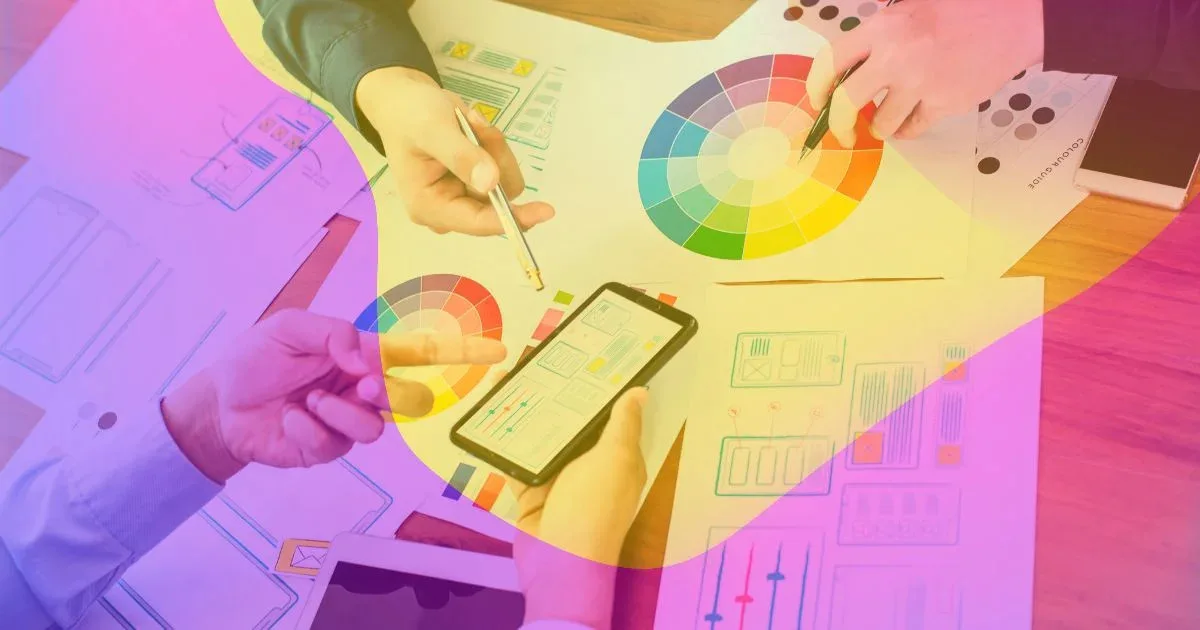
Color gradients have been a popular design trend since the late 1990s. Designers used color gradients to add depth and interest to their designs. With the surge in technology, it has become straightforward to create color gradients digitally and add powerful visuals to your graphic design. Color gradients are also being used in UX to create UX color palettes. This blog will teach you how to use gradient color in UX design.
What Is a Color Gradient In UX Design?
When designing a website, color combination plays a significant role in its visuals. A gradual transition from one color to another is referred to as a color gradient or color transition. This blending can take place between hues of the same tone (for example, light blue and navy blue), hues of two distinct tones (for example, blue and yellow), or even more than two hues (from blue to purple to red to orange).
Due to their natural relationship with light and dark, color gradients are excellent for giving image depth. Images can also be given a sense of proximity and distance by combining a gradient with various opacity levels. Because they change and flow across a wide range of color tones, they increase the number of colors available in design.
Why Are Gradients Used in UX Design?
Gradients are becoming popular again and are used in branding, art, typography, and user interface design. Gradients are an essential part of any UX designer’s toolkit. They’re a simple and effective way to add color and variety to your designs without worrying about pixel-perfect accuracy or the costs of creating custom UI elements.
Gradients are used in UX design to add color, texture, and depth. They also create visual interest and draw the eye toward certain design parts. A gradient can help you create a focal point for your user’s attention or give them something fascinating to look at to keep them interested in your content.
The purpose of using gradients in UX design is to give your users a sense of depth and motion. When you have enough gradients, users will feel like they’re walking through a forest or watching a movie scene unfold before their eyes. Gradients make your design more lively because they help draw attention to key areas of your website or app. The colored areas help guide users’ eyes toward where they want them to go next, which makes navigation easier for everyone involved.
Read here about How to Become a UI/UX Designer?
5 Different Types of Color Gradients
Several color gradients have different patterns starting from a central focal point. The color starts from that point initially and then blends in with the rest of the colors. This creates an illustration that is visually pleasing and aesthetic for the eyes. Let’s discuss five types of color gradients in detail.
- Radial
- Linear
- Conix
- Reflective
- Diamond
1- Radial
A radial gradient originates from the center or a focal point. It is darker in the middle, and the color spreads around the middle point. There is much room to work with the size and transition in a radial gradient.
2- Linear
In a linear gradient, there is a straight line from which originates a band of colors. The gradient color transitions smoothly from one side of the line to the other. The line can either be horizontal or vertical.
3- Conic
As the name suggests, conic gradients originate from a center point of a cone-shaped formation. They are similar to radial gradients, but the only difference is that radial gradient transitions from a center, whereas conic gradient shades in circular clockwise areas.
4- Reflective
A reflected gradient is like a mirror and a linear gradient together. In contrast to a linear gradient, which only shades one way, the color is mirrored from a center line in both directions.
5- Diamond
A diamond gradient uses quadrilateral shapes. It originates as a diamond shape from the center starting point, and the edges of the gradient look like the corners of a diamond.
How To Use Gradient Color in UX Design?
Moving on to the main question,’ how to use gradient color in UX design?’. Gradient colors are all the rage. They’re a great way to add a little liveliness to your design, but they can also be tricky. Here’s our guide to working with gradients in 2024.
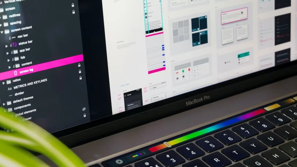
The first thing you’ll need is gradient generators. There are tons of them out there, and they’re super easy to find—just Google ‘gradient generator’ or ‘web design tools.’ They’ll show you how to create different gradients by changing the type of color distribution (the slope) and starting and ending points. Some of the best tools are mesh gradient, Gradient by Unfold, and CoolHue. If this sounds intimidating, don’t worry! We’ve got some examples below so you can see what it looks like from the inside out.
Once you’ve gotten the hang of creating these essential gradients, it’s time for some creativity! You can use gradients for everything from website backgrounds to app elements like buttons or text boxes. We recommend using shades of gray or black as your base color (because everyone loves those) and other colors like reds, blues, greens, and yellows as accents that pop against white backgrounds.
Best Tips To Use Color Gradients
Now that we know how to use gradient color in UX design and why it is an excellent way to enhance your user experience let’s learn in detail about best practices to use in color gradients.
- Select the right colors
- Experiment with different colors
- Make smooth transitions
- Carefully choose the light source
- Use separate shapes and patterns
- Opacity
- Always check the color contrast
- Avoid grey colors
- Combine with Grain Textures
- Use 2D and 3D compositions
1- Select the Right Colors
While making colors, you have a color wheel from which you can choose a similar color pattern. You can also choose from shades of the same color as it creates a clear pattern. Choosing the right color is very important for a brand regardless of what they use the color gradients for. In UX, you must be more careful with gradients as they can affect the whole user experience.
2- Experiment With Different Colors
Remember that creating gradients doesn’t mean that you have to blend only two colors. Because sometimes, just using two colors does not create a charming effect in the beginning. So try using one color in the middle of two colors or experiment with different colors in the color wheel.
3- Make Smooth Transitions
Your transition should look smooth by using smooth colors in the gradient. Sudden shifts in color that create a whole different effect are unpleasant. That is why be careful with how your transitions appear to the customer’s eyes.
4- Carefully Choose the Light Source
Your light source in a color gradient creates a path for the user’s attention. You need to have a clear idea of how you want your light source to make navigation easier for the viewer. It is the essential part of your page, app, or product.
5- Use Separate Shapes and Patterns
You may apply a gradient over an existing color to combine more tones without being cluttered or forced by using various shapes for the fill color and gradient color in your design. You can make two comparable and cooperative points of origin or sources of light by combining two dissimilar shapes, such as a circle and an oval. This enhances your design’s depth and intrigue without adding extra complexity.
6- Opacity
Changing the opacity of your color gradient is an excellent method to use color and light in a design. Doing this allows the colors to meld not just with one another but also with the background, giving your design a broader, more developed appearance.
7- Always Check the Color Contrast
Always check the color contrast ratio to improve the accessibility of your website. You can use tools to test the color contrast ratio for web content contrast standards.
8- Avoid Grey Colors
You won’t get a beautiful gradient if there is a gray zone between the shades. So to avoid this, use shades with similar intensity. Make both ends of the gradient with the same color.
9- Combine With Grain Textures
Those little dots you see on the screen imitate the airbrushing technique used by well-known Art Deco painters. One simple method many designers use to improve any project is the combination of grain textures and gradients. Make a copy of your item, add a light gradient, then select the Grain effect.
10- Use 2D and 3D Compositions
Now you have the tools with which you can easily add 2D and 3D shapes in your gradients. You may imitate a three-dimensional space by adding highlights, mid-tones, and shadows with gradients.
By doing this, you improve your design and make it more aesthetically appealing, in addition to giving the appearance of depth. When creating gradients, it is often advised to start with a hue, then add white for highlights and black for shadows. Don’t be afraid to experiment with your colors until you have a realistic three-dimensional shape.
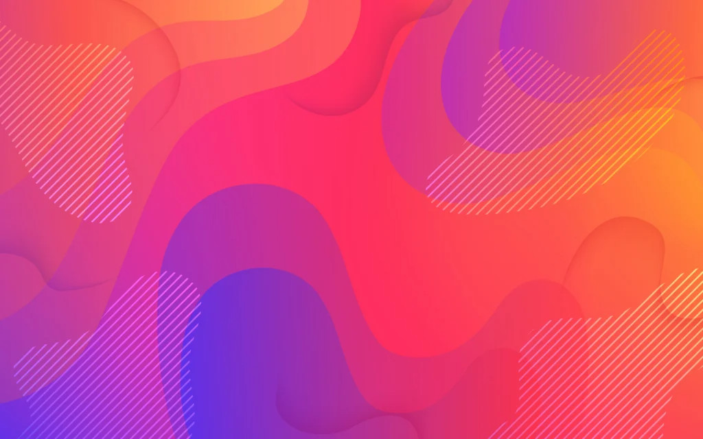
Trends and Examples of Gradient Designs in 2024
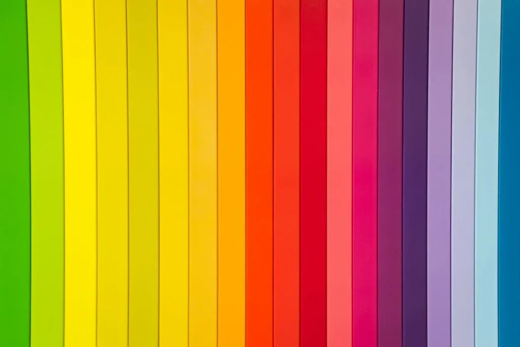
Some gradient designs are always trendy and have a good combination that suits well with different websites. You can use these gradients in your UX design. Here we have a list of gradient combinations that you can find on any tools or search on the web to copy for your design:
- Dusty Grass
- Sand to Blue
- Relaxing Red
- Sublime Light
- Megatron
- Blue Raspberry
- Crystalline
- Pink Fish
- Yellow Mango
- Juicy Grass
- Sea Lord
- Cherry Blossom
- Fresh Air
- Stellar
- Noon to Dusk
- Sunrise
Search for these color gradients and think about which ones are best suited for your UX design. The gradients should also reflect your brand’s image. Or you can choose gradients that could capture the attention of your target customers. It all depends upon what goal you are trying to achieve with your UX through color gradients.
Conclusion
Color gradients are a decent way to enhance your elements of design. They are always trendy and help you optimize your users’ experience. Expert graphic and UX designers are proficient in designing gradients and using them to make certain elements stand out. Apart from that, gradients are not very difficult to create. A gradient UI design can easily be created with specific tools available in the market. You need to clearly understand your vision behind the design and experiment with different gradients.