Welcome to our blog, where we give the best and latest knowledge about the design world. Today, we’re exploring the concept of Gestalt’s Law of Symmetry—a fascinating principle that holds the key to creating visually harmonious and balanced designs. Symmetry is vital in how we perceive and connect with visuals, influencing our understanding and emotional response.
From the captivating beauty of perfectly mirrored arrangements to the subtle interplay of elements of design working in unison, we’ll uncover the magic of Gestalt’s Law of Symmetry and the artistry it brings to design. Let’s discover how Gestalt’s law is important in shaping symmetry of UX design!
What Does the Law of Symmetry State?
As defined by Gestalt psychology, the Law of Symmetry states that humans perceive symmetrical objects and forms as more visually pleasing, balanced, and organized than asymmetrical ones. According to this principle, our brains naturally seek order and harmony in the visual stimuli we encounter.
We view symmetrical elements as a complete whole, with the two sides mirroring each other in shape, size, and arrangement. The Law of Symmetry suggests that symmetry is inherently attractive to us, and we find it easier to process and comprehend symmetrical designs than those that lack balance and symmetry.
Relation Between the Law of Symmetry and UX Design
The Law of Symmetry adds a touch of visual magic to UX design. Designers build a harmonic and balanced interface that quickly appeals to users’ eyes by using symmetrical features. Symmetry gives the design a sense of order and organization, making it visually appealing and easy to navigate. It’s like a flawless ballet of elements, with everything in its proper place, enabling users to explore and interact with the interface easily.
However, the significance of symmetry extends beyond aesthetics. It is a psychological phenomenon that appeals to our natural tendencies. Symmetrical designs match users’ expectations and lessen the cognitive load, allowing our brains to process information and understand the interface more easily. It’s similar to providing users with a familiar path to follow, helping them through the digital experience with confidence and clarity. Embracing the Law of Symmetry in UX design is like giving your consumers the gift of visual delight and intuitive interaction, producing an experience they won’t resist.

Benefits of Symmetry in UX Carousel Design
Symmetry in UX design offers the following benefits that are discussed in detail below:
- Visual Balance
- Clear Navigation
- Responsive Design
- Accessibility
- Content Focus
- Aesthetic Appeal
- Ease of Understanding
- Consistency

1- Visual Balance
Symmetrical carousel designs create a sense of visual balance, where elements are evenly distributed and aligned. This harmony and satisfying user experience can be achieved by decreasing visual distractions and making it easy to focus on the text.
2- Clear Navigation
Symmetry aids in providing clear and intuitive navigation within the carousel. Users can quickly understand the layout and predict the placement of controls, such as navigation arrows or indicators, resulting in a smoother browsing experience.
3- Responsive Design
Symmetrical carousels are often more adaptable and responsive to screen sizes and orientations. The balanced structure allows for easier scaling and rearrangement of content, ensuring that the carousel remains visually appealing and functional across various devices.

4- Accessibility
Symmetry can improve accessibility by providing clear visual cues and predictable interactions. Users with cognitive or visual impairments may find it easier to understand and navigate a symmetrical carousel, as it reduces the cognitive load and offers a more structured interface.
5- Content Focus
By maintaining a balanced layout, symmetry draws attention to the content within the carousel. Users can focus on the images, text, or media presented rather than being distracted by an uneven or cluttered design.
6- Aesthetic Appeal
Symmetry often imparts a sense of elegance and aesthetic appeal to carousel designs. Well-balanced and proportionate layouts can create a visually pleasing experience that resonates with users, enhancing their overall perception of the website or application.

7- Ease of Understanding
Symmetry helps users comprehend the carousel’s functionality and purpose more easily. By presenting information in a well-organized and balanced manner, users can quickly grasp the sequential nature of the carousel and navigate through the content without confusion.
8- Consistency
Symmetrical designs promote consistency in the carousel’s structure and layout. Each slide has a consistent visual structure, which helps viewers understand and interact with the content. Consistency also contributes to a sense of familiarity, which can enhance usability.
Remember that while symmetry can be advantageous, it’s essential to consider the specific context, content, and target audience when designing a carousel.
3 Types of Symmetry in Design
There are three primary types of symmetry in design:
- Reflection Symmetry
- Radical Symmetry
- Translation Symmetry
Reflection Symmetry
Reflection Symmetry (also known as bilateral symmetry) occurs when an object or design can be divided into two halves that are mirror images of each other. Benefits of reflection symmetry in design include:
- Visual Balance: Reflection symmetry provides a sense of visual equilibrium and harmony, creating a balanced and pleasing composition.
- Easy Comprehension: The mirror image quality makes it easier for users to understand and interpret the design, allowing for clear recognition and identification of patterns and elements.
- Familiarity: Reflection symmetry is commonly found in nature and everyday objects, so users are accustomed to this type of symmetry, making the design more relatable and familiar.
Radical Symmetry
Radical Symmetry (also known as rotational symmetry) occurs when elements are arranged around a central point, with identical or similar patterns repeating circularly or radially. Benefits of radical symmetry in design include:
- Eye-catching Visual Impact: Radical symmetry draws attention and creates a focal point at the central axis, making the design visually striking and captivating.
- Dynamic and Energetic: The repetition of patterns radiating from the central point creates a sense of movement, energy, and flow in the design.
- Balance and Cohesion: Radical symmetry ensures that all elements are evenly distributed around the central axis, resulting in a balanced and cohesive composition.
Translation Symmetry
Translation symmetry occurs when patterns or elements repeat regularly and predictably, shifting in parallel without rotation. Benefits of translation symmetry in design include:
- Seamless Repetition: The regular repetition of elements creates a seamless and continuous pattern, allowing for a visually pleasing and cohesive design.
- Versatile and Scalable: Translation symmetry can be easily extended and applied to cover larger areas or adapt to different screen sizes, making it a versatile choice for scalable designs.
- Engaging Visual Interest: The repetition and arrangement of elements in translation symmetry can create intricate and captivating designs that engage users and hold their attention.
- These different types of symmetry in design offer unique benefits and can be strategically employed to achieve specific aesthetic and functional goals in various design contexts.
Examples of Using Symmetry in UI/UX Design
Many popular brands have successful websites because the designers use the right style of symmetry in web design. Let’s look at some popular websites that use the law of symmetry in their UI/UX design.
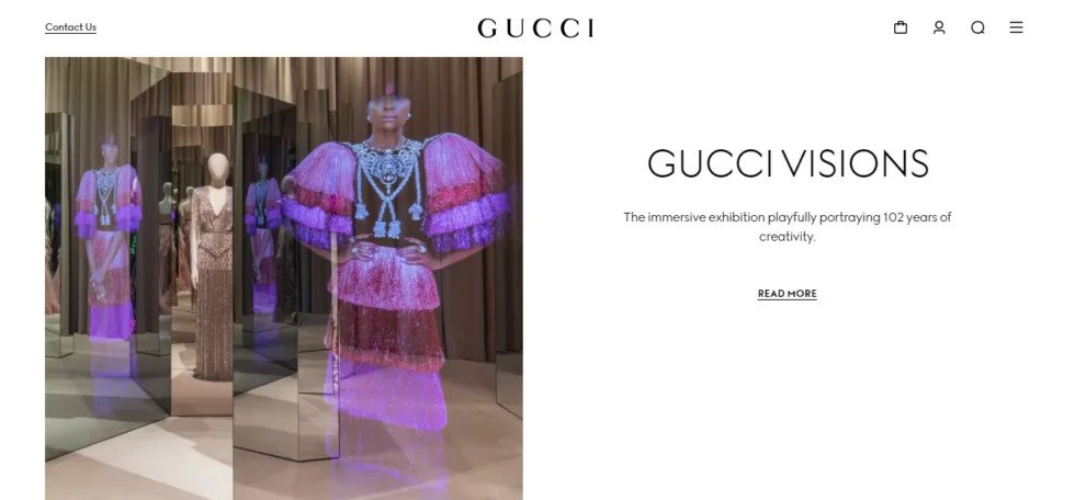
Gucci’s Website
The luxury posh brand surely has a website that reflects its identity and premium taste. One great element holding this website’s eccentric look is the symmetry of elements. Gucci’s website is an excellent example of symmetric balance on websites.

Apple’s Website
Apple’s website is known for its clean and minimalist design, which often incorporates symmetrical elements. The homepage, for instance, typically features a centered hero image or video with balanced content blocks below. The navigation is usually placed at the top center, and the layout maintains a sense of visual equilibrium with equal spacing and alignment.

Dropbox’s Website
Dropbox’s website also demonstrates symmetry in its UI design. The homepage often utilizes a centered layout with balanced content sections. Using grids and columns creates a symmetrical structure for presenting information and visual elements. The placement of navigation, headers, and images is often strategically aligned, resulting in a visually cohesive and harmonious design.

Wrap Up
Incorporating symmetry can profoundly impact the user experience when it comes to design. Symmetrical designs create a sense of visual balance and stability, making it easier for users to process and understand the interface. Symmetry also helps establish clear hierarchies, guiding users’ attention to important elements and fostering a sense of coherence.
Moreover, symmetry enhances the aesthetic appeal of a design, evoking a sense of elegance and harmony. It can create a feeling of familiarity and comfort for users, as symmetrical patterns are common in nature and our surroundings. Make sure to hire specialized UI/UX designers that can elevate your web design by using the laws of UX in carousel design.
FAQs
What are the elements of the law of symmetry?
The elements of the law of symmetry involve using balanced and mirrored groupings of visual elements, shapes, and patterns in design, creating a sense of harmony and visual equilibrium that appeals to people.
Why is symmetry used in the design?
In design, symmetry is used to achieve visual balance, improve aesthetics, and generate a feeling of order, making it easier for people to understand and engage with design aspects.
