21 Laws of UX for Building Successful Designs
The Laws of UX explain how people perceive, decide, and act in interfaces. Use these principles to design products that feel clearer and easier to use.

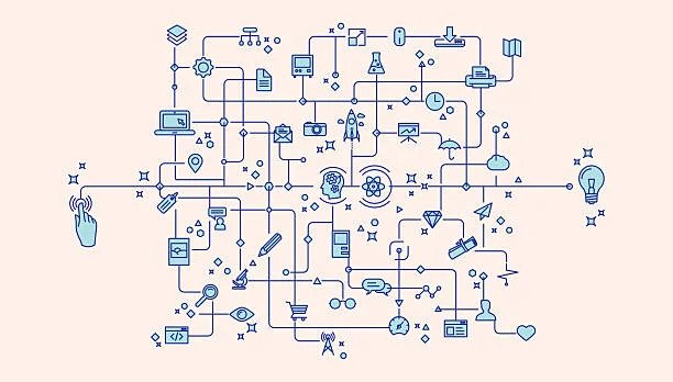
We, as humans, have always held the belief that all of the things and experiences with which we interact should be made as simple as possible.
It’s interesting to note that we’ve all encountered or experienced the majority of these laws at some point in our lives or while interacting with various digital interfaces. We’ve always known how we perceive and analyze different experiences and interfaces, and we’ve always tried to make sense of even the most abstract ones. The Laws of UX are essentially just an articulated framework of human psychology and perceptions that have been brought to the forefront.
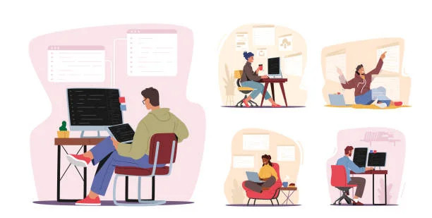
What is UX?
User experience design, often known as UX design, refers to the process that design teams go through in order to develop products that provide people with meaningful and pertinent experiences. This encompasses the design of the complete process of purchasing and integrating the product, which incorporates factors like branding, design, usability, and function, among other considerations.
But how do you decide what are the best practices to create the best designs? For this purpose, there exist a set of Laws of UX to guide the designers.
You need to be familiar with the underlying rules of how users interact with your UX, regardless of whether you are a novice user experience designer or a seasoned product marketer.
Related: Is UI-UX a Good Career Option for Designers in 2024?
These UX principles serve as a guide for product design because they illuminate the psychological drivers underlying the expectations of customers. Because of this, everyone who wants to build designs that are successful absolutely has to adhere to them.
Following are the 21 laws of UX:
- Aesthetic-Usability Effect
- Doherty Threshold
- Fitt’s Law
- Goal-Gradient Effect
- Hick’s Law
- Jakob’s Law
- Law of Common Region
- Law of Proximity
- Law of Prägnanz
- Law of Similarity
- Law of Uniform Connectedness
- Miller’s law
- Occam’s Razor
- Pareto Principle
- Parkinson’s Law
- Peak-End Rule
- Postel’s Law
- Serial Position Effect
- Tesler’s Law
- Von Restorff Effect
- Zeigarnik Effect
Let’s further discuss these Laws in detail.
1. Aesthetic-Usability Effect
Users have the propensity to view attractive things as being more useful. This phenomenon is referred to as the aesthetic-usability effect. People have a tendency to assume that things that seem better will operate better, even if they aren’t truly more effective or efficient. This is because people prefer to judge things based on their appearance.
Consumers tend to consider attractive items as more helpful than they are as they like aesthetically pleasing designs. People think that better-looking objects are more effective or efficient, even if they aren’t. People judge based on looks.
Positive emotional responses to your visual design reduce usability complaints. Good news. This is why a beautiful and functional UI is important for user experience.
1995 was the first year aesthetic usability was studied. Hitachi Design Center researchers Masaaki Kurosu and Kaori Kashimura evaluated 26 ATM UI prototypes with 252 people.
The aesthetically pleasing design was linked to perceived usability than actual usability. Kurosu and Kashimura observed that customers are impacted by an interface’s aesthetics. Emotional Design by Don Norman discusses this (2004).
Aesthetic-usability limits. A beautiful design may overlook small usability difficulties, but not major ones. Users can’t buy products they can’t find. Even the best-looking websites can’t be found. Align form and function. Users lose tolerance when interfaces lack utility or beauty. Websites are quickly abandoned.
Related: Design Consistency Guide: Best Practices for UI and UX
2. Doherty Threshold
Human-computer interaction works best when the reaction time is as such that no one has to wait on either end.
Doherty Threshold measures your design’s speed. Make your audience feel in control to maintain their attention. When users see a reaction to each click, they feel in control of the interaction, which helps them use the interface.
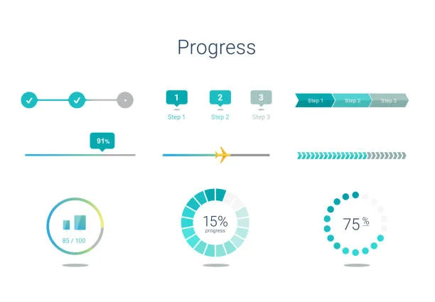
To promote navigation, respond to user actions within one second. Slower and you risk losing consumers who feel your design is holding them back. Even if the procedure takes a while, keep users engaged. Progress bars and animations can show users’ background work.
3. Fitt’s Law
Make sure the user can readily reach the goal action, both in distance and size.
Paul Fitts’ design law says that a design’s usability rises if the interactive element is:
- Easy to select
- Independent of the rest of the components that make up the interface (larger and differently colored)
- Can be clicked anywhere for easy action
- Minimal user effort
Hover social sharing tools encourage users to contribute content. Organize action items in a pie menu to make the objective easy to reach. Here, selections are equally spaced in a circle, in contrast to a navigation bar.
Related: How To Get A UX Design Job With No Industry Experience
4. Goal-Gradient Effect
When one is closer to their target, they are more likely to make progress toward achieving that target.
According to the Goal-Gradient Effect, users will work more quickly toward achieving a goal the closer they are to finishing that task. Because of this, making it appear as though users are making artificial progress toward a goal will help to increase the likelihood that users will have the motivation to finish that task.
Example: LinkedIn
The Goal Gradient Effect is used in UX components that display progress, such as LinkedIn’s “Profile Strength”. LinkedIn has increased profile completion by linking a progress bar to a degree of completeness, “Intermediate.”
They’ve coupled the Goal Gradient Effect with data to convince users that their work would help them get “found by recruiters.” LinkedIn makes it evident that users’ goals are closer than they realize by linking profile completion to a new job.
5. Hick’s Law
If there are too many options and they are difficult to understand, the user is less likely to actually make a selection.

Hick’s Law, also known as the Hick-Hyman Law, is something you are familiar with if you have ever decided against enrolling in a class because the list of available electives was too extensive.
In essence, having an excessive number of options can cause users to experience choice paralysis, also known as information overload, which prevents them from taking any kind of action at all. So minimize available possibilities.
6. Jakob’s Law
Users would like that the design of your site be similar to the design of other websites that they use.
Jakob Nielsen, the guy responsible for defining this law, insisted that you should design for familiarity.
According to Jakob’s Law, consumers spend the vast majority of their time visiting other websites. They like websites that function in the same manner as every other website because of this reason.
This indicates that it is always preferable, from a design standpoint, to use common design solutions that are already well-known to end users.
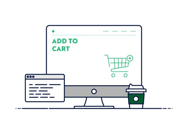
Because the most effective designs are user-centric, it is helpful to harness prevalent mental models or to develop designs that live up to the expectations of users. For example, people anticipate discovering the “shopping bag” function in the navigation bar of an online retailer’s website.
7. Law of Common Region
Users will group together any items that are located within the same region that has a clearly defined boundary.
According to the Law of Common Region, things that are located within a border are thought of as a group and are presumed to have some sort of attribute or functioning in common with one another.
When a user views a design, they make decisions based on grouped pieces in a target area in order to choose which user interface (UI) sections they should engage with.
Creating common areas with clearly defined boundaries in interactive designs may be done in a number of different ways. Some of these approaches include shading a collection of items, adding a background color, and marking sections in the header, footer, and navigation panel.
8. Law of Proximity
Users group close things.
The Law of Proximity, just like the Law of Common Region, helps users interact with your design. It implies people view close-together components as related.
To generate common region elements, you must carefully organize elements. This requires using whitespace strategically to divide or group components.
9. Law of Prägnanz
Because understanding requires cognitive work, people comprehend visuals that are either complicated or ambiguous by simplifying them.

According to the law of prägnanz, if your brain is shown a collection of confusing or complicated items, it will attempt to simplify the appearance of those objects to the greatest extent that it can.
Your audience will constantly look for simplicity, even in complicated or ambiguous designs, in order to protect themselves from experiencing mental overload. To put it another way: Because of this, call-to-action buttons are often in the shape of rectangles, as opposed to hexagons or any other complicated structure.
10. Law of Similarity
Users have a tendency to see comparable aspects in a design even if those parts are distant from one another in the design.
The Law of Similarity indicates that customers see visually comparable parts in a design, such as those that share the same color, size, shape, position, and movement, as being connected in meaning or functioning. Examples of this include sharing the same color, size, shape, and orientation. Because of this, links that have already been clicked are shown in a different hue compared to ones that have not yet been clicked.
11. Law of Uniform Connectedness
Components that are believed to have a link to one another visually are perceived to have a stronger relationship than elements that do not have a connection.
Another principle of grouping is presented here. According to the Law of Common Region, consumers perceive connectedness between things that are arranged together. To reiterate, this implies that you make use of visual direction to group items that are connected in order to fulfill the requirements of your audience.
12. Miller’s law
Working memory can contain 7-9 things only. Miller’s law defines why our attention is limited.
According to Miller’s Law, the number of things that the typical person can keep in their working memory at any given time is around seven. This number is sometimes referred to as The Miracle Number 7, Add or Less 2.
People can only keep seven to nine items in their working memory, therefore a lower cognitive burden to make a decision. So never cluster your design with too many options or elements. It helps keep things in the working memory.
Examples:
- Hick’s Law suggests reducing options.
- Using learning models to lessen learning burden (Jacob’s Law)
- Keep your design simple so consumers can focus on fewer aspects.
13. Occam’s Razor
Choose a simple design. Occam’s Razor helps choose design prototypes. Select the simplest design.

Not simple? Remove items that don’t affect design function. “Good design is as minimal as possible,” explains Dieter Rams.
Keep it simple, dumb is also a rule.
14. Pareto Principle
20% of labor yields 80% of outcomes.

According to the Pareto principle, around 80 percent of results stem from 20 percent of causes. This holds true for many different outcomes.
The Pareto Principle is popular in many fields, not simply design. It’s useful for limited-resource or time-sensitive applications.
Using the Pareto principle, create for your audience’s greatest advantage. Pareto Principle example: minimal viable product (MVP). Low-fidelity prototypes require less input but show most of the results. UX designers may use this technique to focus on the most effective features to construct.
15. Parkinson’s Law
A task consumes all available time.

According to Parkinson’s Law, the amount of work will always increase to occupy the amount of time that is available to finish it. People will continue to work on a job until the time that has been assigned to them has passed. This may be used by a user experience designer (UX designer) to create interfaces that are more effective and assist people to finish a job in a timely way.
Parkinson’s Law is also popular among productivity gurus. UX designers should restrict job completion time to what consumers anticipate.
Let’s suppose consumers anticipate filling out forms in three minutes. Usability testing showing people completing the job might reveal it. Anything that shortens this is excellent.
16. Peak-End Rule
People rate an event depending on how they experienced it at the beginning and finish, not on average.

The peak-end rule is an example of a selection dissonance that alters the manner in which individuals recall prior activities and experiences. An individual’s evaluation of a previous experience is determined, according to the peak-end rule, by the emotional high points experienced during the encounter as well as the conclusion of the experience.
If you think of a recent project you loved, you’ll remember some intense moments and the end.
User journeys are similar. Focus on the closing moments of a consumer’s trip.
A vibrant animation or beautiful picture can increase user experience after a successful interaction. It may make the experience unforgettable.
17. Postel’s Law
Accept more and demand less from your users.

John Postel, an American IT researcher, developed what is now known as Postel’s Law, which is often referred to as the robustness principle. At the present time, his legislation serves as the foundation for a variety of software development rules. “Be conservative in what you do, but be liberal in what you tolerate from others,” the rule instructs.
Postel’s law is the stability principle. Two points:
- Take user contributions. Accept a user’s entry of ‘US’ instead of ‘United States and transform the data for consistency.
- Limit your requests. You demand only what’s essential to stimulate action. Filling out a long form to acquire an e-book or subscription is annoying, right?
18. Serial Position Effect
The first and last things in a series are the most memorable.
The Serial Position Effect proposes placing UX items to the far left and right to promote memory. Middle out the least important components.
Studies prove its importance. Multiple eye-tracking studies show that web material is consumed in a zigzag, lawnmower, or F pattern. They all observe extremes, therefore presenting vital information there draws users’ attention.
The first and last items are usually more memorable. In studies, participants remembered terms at the list’s ends.
19. Tesler’s Law
Tesler’s Law asserts that every system has an inherent level of complexity.
It’s no secret that every single design is really difficult to pull off. You are responsible for simplifying things as much as you can within the given parameters. You will be able to assist users in concentrating on the work at hand rather than finding out how to traverse the design if you take these steps.
20. Von Restorff Effect
Users are more inclined to recall an object that’s even marginally distinctive than others.

The Von Restorff effect states that, given a certain number of new things to learn, one of those new things will be easier to remember than the others if it stands out from the others in some fundamental way, such as by its size, color, as well as other basic qualities.
Hedwig von Restorff, the man who defined this UX rule, observed that information should be visually distinct. This is why CTA buttons are usually a distinct color.
Also, highlight visual aspects to avoid user confusion.
21. Zeigarnik Effect
Interrupting tasks are better remembered than finished ones.
The Zeigarnik Effect was created after studying the influence of finished and incomplete tasks on memory. Completed activities were harder to recall than incomplete ones. This memory stickiness drives users to act.
Interrupted tasks produce tension. This stress promotes memory and is released when the work is over.
Several firms use this effect for newsletter and blog subscriptions. By separating the procedure into two parts, you’ll convince more users to subscribe and remember you.
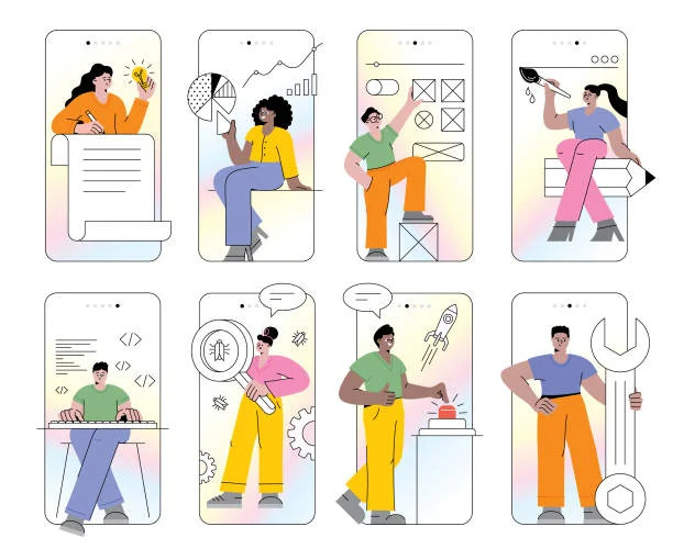
Design Practices at Hapy Design

Many startups have trouble designing and creating a product that is not just useful but also simple to operate. This may be a very difficult obstacle, and it frequently results in a solution that does not fulfill the requirements specified by the customer.
Hapy Design is a digital product agency that focuses on the design and development of scalable solutions for startups in the business world. Because we are aware of how essential it is to have a high-quality product, we put in a lot of effort with each of our customers to ensure that their goods are not only efficient but also simple to operate.
We at Hapy Design incorporate these principles to unify a customer’s image with a perfectly designed product that aligns with their vision.
Conclusion
As we wrap up, here are some points to remember:
- Create clutter-free, simple mental model-based designs to reduce navigation friction. Focus on user-friendly UX and engaging UI designs since visually beautiful designs are usable.
- Make sure the action button is constantly accessible, clickable, and interactive so taking action is easy. Visually distinguish it from other design components.
- Make navigation responsive to provide users control. Progress bars and animations can help convey this.
- Reduce brain overload by minimizing options, features, and steps.
- Users view tightly grouped components as functionally connected. Strategically organize interactive design components using backdrop color, limits, and forms. Focus limited resources on user-interacting regions.
- Place crucial parts on the far right or left to improve remembering. Ensure no action takes longer than expected. When you can’t delete any more elements, stop designing.
FAQs
How Many Laws Does UX Have?
What is UX Laws and Principles?
What are UX Standards?
What are the 5 Principles of UX?
1. Hierarchy.
2. Consistency.
3. Confirmation.
4. User Control.
5. Accessibility.