12 Ways To Improve Website Scannability for UX Design Success
Designers must improve website scannability for UX design success to help their target audience better understand content and make them interested in it.

Designers try their best to use the content to drive traffic to websites. Your website’s content increases traffic and referrals and increases customers’ engagement with the interface as they get more interested in well-optimized content. But it is also necessary to make your customers stick longer on your website and navigate it thoroughly to convert impressions into leads.
Scannability has a role in UX design success as it makes the most relevant and essential information on your website easy to find. That is how you enhance the customer experience and satisfy them with your brand. So in this blog, you will learn about scannability and its role in UX and how you can improve your website scannability for UX design success.
What Is Scannability in Websites and UX?
The combined effect of writing and formatting techniques that makes it easier for the target audience to read the body of words is called scannability. The most important thing on a website page is its content and words. Readers do not want to read long paragraphs to get their desired information. They want you to get to the point quickly.
Therefore, increasing a site’s scannability helps to communicate your site’s purpose to the users more effectively. And as a result of optimized content with enhanced scannability, users will stay on your website for extended periods.
Read here about the 21 Laws of UX for Building Successful Designs
What Is the Importance of Scanning Websites?
Many people ask why it is essential to increase the scannability of your website for UX design success. Well! There are many logical explanations, but to be concise, it is because when people visit your website, they do not read your content word by word but instead scan the whole page. It means that the first impression is the last.
According to marketing expert David Zheng users give up a website or leave it in less than 15 seconds in as much as 60% of the cases.
People are not interested in reading the content but in clicking, liking, and sharing it. If they find it difficult to search the information they came on your website looking for, then you will lose their attention span. Therefore, you have to communicate a lot of information in a short amount of time.
Benefits of a Scannable User Interface
To understand the benefits of a scannable interface, you need to observe it from a user’s perspective. It takes effort to produce a scannable website interface, but it proves beneficial. According to studies, the following benefits are obtained from a scannable website.
- Users can quickly get a sense of your page’s hierarchal structure.
- Users can fastly access the information they came on your page for.
- It’s easier for users to choose whether your content is helpful for them or not.
- You get more chances of returning visits to your website.
- Your SEO ranking is improved.
- You get more credibility through content quality on your website.
- Your page’s content corresponds to your customer’s expectations.
- The audience, in a short time, understands the purpose or the message behind your page.
Related: UI/UX best practices.
7 Common User Scanning Patterns
Now let’s learn some common user scanning patterns that will help you better understand how you can improve your website’s scannability. Research has revealed 7 common scanning patterns among people:
- F-shaped
- Layer cake
- Spotted
- Committed
- Z-pattern
- Marking Pattern
- Bypassing pattern
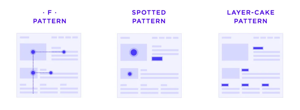
1- F-shaped
The F-shaped pattern, also known as the “famous pattern,” was discovered twelve years ago. It is the most coming scanning pattern or behavior among users. In this pattern, the eyes of your viewer move horizontally as they read the content. Reading in this pattern is done systematically and slowly.
2- Layer Cake
In the layer cake pattern, readers follow the headings and subheadings of the content to analyze where the information is relevant or valuable quickly. If they find the information they came on your page looking for, they read it more carefully. This pattern is depicted as a set of horizontal lines. Hence, it is named the layer cake pattern.
3- Spotted
In the spotted pattern, people usually skip most parts of the content and scan visual components like color, shapes, and proportion anomalies that could give the information they are looking for. Readers’ eyes jump between the words to find the exact thing they are looking for.
4- Committed
This pattern is rare to occur because people only use this one when they are seeking out information or are interested in the content. Readers not just scan your website but are motivated to learn. So your content must always be exciting and informative to capture such an audience.
5- Z-pattern
The z pattern stands for the zig-zag model in which users couldn’t find the correct information because of the weak hierarchal structure of the web page or the page’s uniform presentation of information.
6- Marking Pattern
Marking pattern is very common for mobile UX. In this pattern, users focus on one part of the content while scrolling through your web page.
7- Bypassing Pattern
Lastly, the bypassing pattern in which users do not read the complete lines or skip the first parts of a line if there are repeated words in each line.
How To Deliver Value Through User Research and Scanning Patterns?
Delivering value to your customers whenever they interact with your product or interface is necessary to keep them in the loop. In user-centered design, it is essential to make products that are understandable for your users and that they feel connected. Such connections are made, and value can be delivered through user research and understanding scanning patterns.
“Customer-centricity should be about delivering value for customers that will eventually create value for the company”.Robert G Thompson, The Five Habits of Legendary Customer-centric Companies
But how can you deliver this value from scanning patterns? User research is crucial in helping you understand your target audience’s behavior. UI design best practices involve thorough research of your market before starting a project. So to improve the scannability of your interface, designers need to understand their end customers.
When you design a website interface according to the usage patterns and interests, you have a higher chance of getting organic and intuitive traffic on your pages. These solutions create an impact on your audience. Your value is delivered to customers when they get what they came for on your website. Therefore, understanding eye-tracking through user research is very helpful in optimizing your UX.
Also, Read about What is UI Design?
When Should You Make Your Web Pages Scannable?
There is no specific time or forecasted event on which you need to make your websites scannable. If you are thinking about when should you make your web pages scannable, then the answer is simple. You need to regularly update the content on your website so that it doesn’t remain outdated. You will also need to optimize it for market trends. So whenever you feel your pages have outdated information, you need to make changes to make them more scannable.
Or if you are not receiving a good amount of conversions, CTRs, or impressions on your web pages, and your customers are not staying on the pages for long, you might need to improve your website’s scannability. To create valuable and easy-to-understand content, you must stay aware of the market trends and what your audience seeks on the search engine. Then improving the scannability will be fruitful for your web pages.
12 Tips To Make Website Content Scannable
Coming over to the main topic of this blog, “how can you make your website’s content more scannable or how can you improve your website scannability for UX design success? We have gathered a list of 8 important tips that can help you improve your scannability. Follow these tips in your UX design projects and deliver value to your customers:
- Create a Visual Hierarchy
- Make use of the negative space
- Summarize the content with subheadings
- Use bulleted lists
- Emphasis appropriately on the CTAs
- Visualize your content
- Use Images & Videos
- Don’t Use Long paragraphs
- Check the readability of your fonts
- Make the website mobile friendly
- Don’t use too formal language
- Make use of Blockquotes when required
1- Create a Visual Hierarchy
Visual hierarchy in a website’s content is essential for multiple reasons. The visual hierarchy of a digital interface is the arrangement and display of UI design elements to express levels of importance so users can swiftly scan for needed information. When designing a UI layout, a designer can ensure that the finished product has a beautiful, harmonious, and easily scannable layout by considering specific UI design patterns.
A visual hierarchy’s primary objective is to help users understand the relative value of each item of content. You can get your readers’ attention by using text formatting changes like bold, italics, and hyperlinks to direct their focus to the stuff you want to bring their attention to your page.
When a user locates a pertinent headline, they might examine the link to see whether it is reliable. They will then examine the content copy, which is uniform in size, color, and proximity, to assess the outcome. In addition to these elements, Google search results are typically simple to scan due to repetition and alignment.
2- Make Use of the Negative Space
As a designer, you cannot take the usefulness of negative space for granted. A layout is successful when there is negative space between its elements. The elements are highlighted when there is the right amount of negative (white) space surrounding UI elements. It draws attention to the content and saves your layout from becoming crowded. If there is no break between the content in white space, then the brain is less likely to scan interesting objects and is more likely to become confused with so much to scan at once.
3- Summarize the Content With Subheadings
The user gains the most understanding of the subject by adding concise subheadings at the beginning of lengthy content. Big blocks of text frequently elicit unfavorable reactions from readers because if it doesn’t appeal to them, they assume it is irrelevant and a waste of time.
It is crucial to use h2 and h3 subheadings to divide your text into chapters, and these subheadings should be written simply so that readers can instantly comprehend what the chapters are about. Make sure your subheadings are styled clearly and can be distinguished from regular paragraphs. They should be more prominent in font size and perhaps even a different color than the rest of the content.
4- Use Bulleted Lists
Bulleted and numbered lists are another excellent way of improving scannability. The human brain quickly observes information and then arranges it into valuable components. As a result, a user is more likely to understand a list with bullets or numbers than a paragraph with multiple points. It is advantageous to carefully scan lists for possibilities since the negative space generated by lists makes it simpler for a user to scan.
5- Emphasis Appropriately on the CTAs
Calls to Action (CTAs) trigger an immediate response from your users. (CTA) buttons frequently have a very basic appearance, but they are carefully crafted to encourage users to take a specific action, like making a purchase, adding something to their shopping cart, or even visiting another page.
The CTA should be placed next to the material that specifies the action to make it intuitive for the user. CTA is kept prominently visible and highlighted in a better UI design placement.
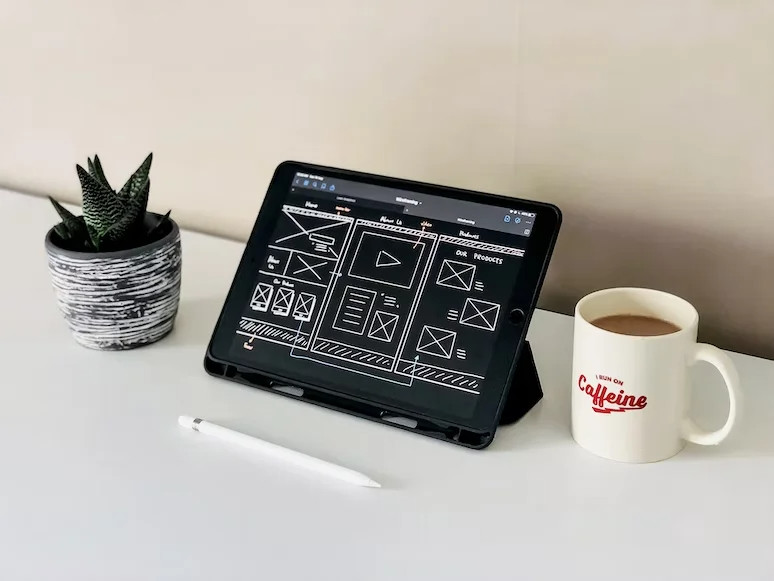
6- Visualize Your Content
Visuals are the most essential part of a website’s content. Since most digital users today are innately visual, they may not necessarily respond effectively to text-based content. The primary visual style concept can quickly draw a user’s attention using original graphics (illustrations, captivating images, etc.). Additionally, they can enhance the text’s readability and visual hierarchy.
A graphic could, however, have the opposite impact if it is not used correctly. It’s crucial that designers fully comprehend the text they are developing before turning essential concepts into graphics.
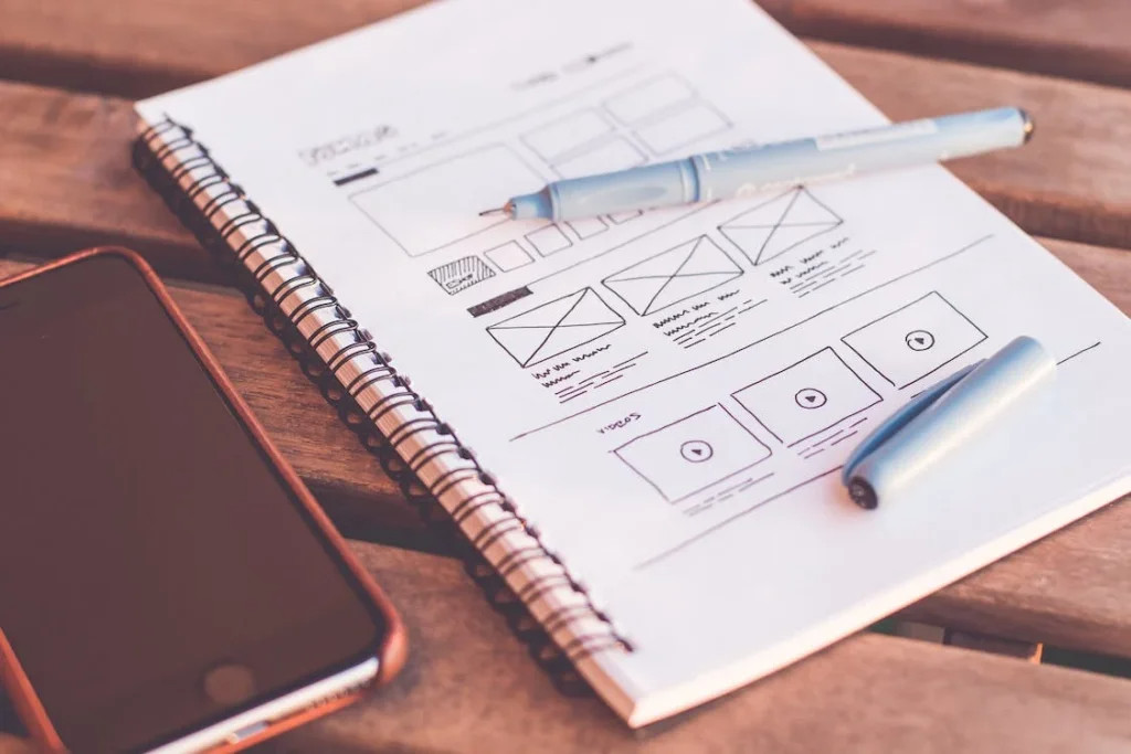
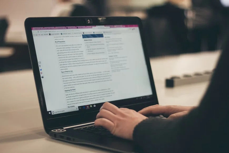
7- Use Images & Videos
When explaining complicated topics, using images, short videos or screenshots helps your readers. It also makes it easier for them to understand how to accomplish specific complicated tasks. But you don’t need to add unnecessary imagery in your content or overcrowd it with pictures because if they load slowly, it negatively impacts your viewers. In other words, use high-resolution images when needed and keep them in mind to enhance website responsiveness.
8- Don’t Use Long Paragraphs
Having a clear and concise structure in your textual content is essential. Therefore, don’t use long sentences or paragraphs on your web pages. Use commas to break extensive sentences into smaller pieces as it increases readability.
9- Check the Readability of Your Fonts
The readability of the fonts means using the right font in the right place. Several factors determine which font size is best for various applications. Due to a large amount of content displayed on many websites, including Google and Facebook, relatively small font sizes are often acceptable. However, using a larger font for websites is typically preferred when the primary content is a text-based piece.
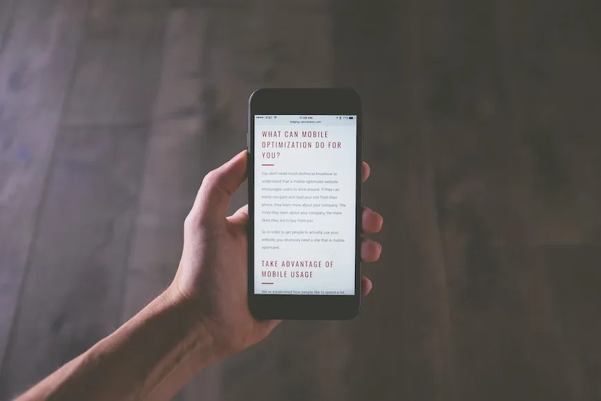
10- Make the Website Mobile Friendly
As most of the population in the world accesses websites using smartphones, it has become necessary to make your website mobile friendly and optimize them according to the mobile-first approach. This will also accomplish the goal of making a responsive web design and makes it easier for users to read the content on whatever device they are on.
11- Don’t Use Too Formal Language
Remember that most website visitors are regular users, not intellectual critics; therefore, using too formal language is not a good practice. Using complex words and highly formal language in your content makes it complicated for the readers to scan and makes the content too dull to read. Learn copywriting techniques to write better language for your content.
12- Make Use of Blockquotes When Required
Lastly, we have blockquotes that are also a good practice for your website’s scannability. It would help if you used the blockquote element when quoting someone or something from another website or individual. This typically modifies the text’s style inside blockquote tags to make it evident that it contains a quote.
How to Measure UX Design Success?
There are specific KPIs that UX engineers or designers use to measure their design’s success. These KPIs are decided while making a UX design strategy. For measuring the success of your UX design, consider these statistics:
- Average time on task
- Completion rate
- Error occurrence rate
- Adoption rate
- Retention rate
- Net promoter score
- System usability scale
Apart from these KPIs, you will need to collect user feedback to analyze their response to the design. Designers usually gather user feedback in the website usability testing phase. It helps you to understand which factors need additional work or optimization and which components of the UX have the potential to increase your customer satisfaction score.
Conclusion
Understanding website scannability and adopting the best ways to improve businesses must grow their digital platforms and keep the audience hooked. If your content is not helpful for the audience, they will quickly lose interest, and you will only get impressions but not organic conversions from SEO.
In this detailed guide, we have given you a list of best practices that you can adopt to improve your website scannability and ultimately achieve UX design success. Remember to impact your viewers through your content’s visual and textual presentation. We hope you will follow these tips and incorporate them into your website interface.