How to Design a 404 Page: Best Practices and Examples
Designing a 404 error page that encourages users to go back on track is harder than you think. This blog post will show you how to design a 404 page.
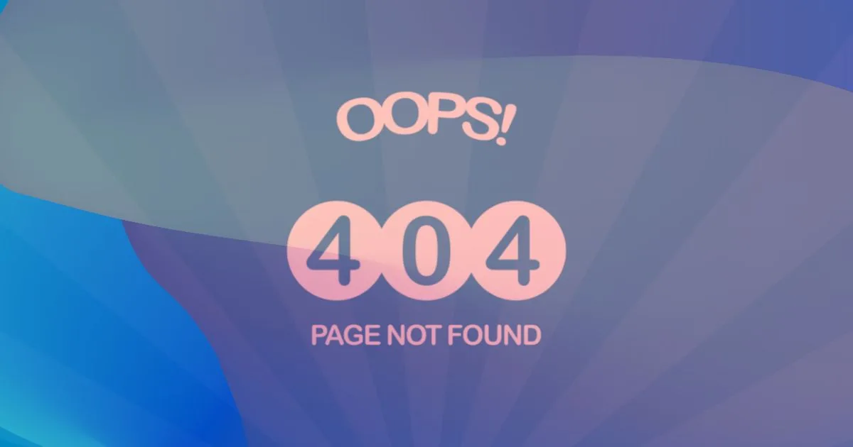
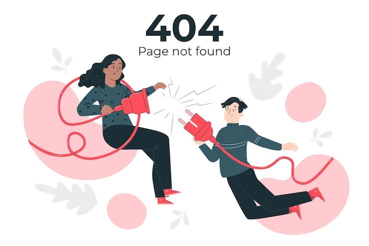
A 404 page is a blank page or a broken link. This kind of page isn’t something you want your visitors to see. You can’t do anything about broken links built into your code, but you can take advantage of 404 error pages to encourage users to convert. A good 404 page doesn’t have to be a boring, generic 404 error. It can be used as an opportunity for branding and conversion.
Designing a 404 page that encourages users to go back on track is more complicated than you think. This blog post will show you how to design a 404 page.
What Is a 404 Error Page?
A 404 error page is a webpage that appears when a user navigates to a page that does not exist. It’s also known as a “page not found” error. This can happen for several reasons, the URL was mistyped, or there is an error with the server that hosts your site. The content has been moved or deleted, but the web address remains the same. The file may be temporarily unavailable due to technical problems or maintenance work on our side etc.
Why Is a 404 Page Important?
If you’re looking for an easy way to improve your user experience, look no further than one of the most overlooked pages on your website: the 404 page.
A 404 page is what people see when they enter a URL that doesn’t exist. It’s important because it can help you reduce bounce rates and improve customer retention by showing visitors where they went wrong in their search and helping them understand that it’s not their fault that they can’t find what they want.
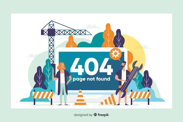
How to Design a 404 Page?
404 pages are a great way to let visitors know that something went wrong and offer them a way to get back on track. But how do you design one? Let us walk you through these nine easy points that will explain to you how to design a 404 web page:
- Decide on What Kind of a Page You Want to Create
- Include a Simple 404 Error Message
- Elements of Design Should Match the Rest of Your Website
- Link to Different Pages on Your Website
- Navigation Bars
- Search Bars
- A Light Touch
- Keep It Simple
- Call to Action
Related: How to Design a Website in 15 Steps?
1) Decide on What Kind of a Page You Want to Create
First, you must decide what 404 page you want to create. For example, if the error was caused by a bad link in an email or social media post, it’s probably best not to create an entirely new page for this situation. Instead, change the link in the body of your email or post so that it goes directly to your main homepage instead of taking users elsewhere on your site.
If the error is more severe, like if someone mistyped their URL, you might want to create a specific page that explains what happened and offers suggestions for how they can fix it. This could include links back to standard search engines like Google or Bing so they can find what they’re looking for more quickly than if they had relied on links within your website alone. If possible, include an image of what they were looking for so it stands out even more clearly against other text-only content on this page.
2) Include a Simple 404 Error Message
When designing your 404 page, it’s essential to keep it simple. The more complex and confusing the page is, the more likely people will click away from your site before figuring out what’s going on.
The best thing you can do is to include a simple error message that tells people precisely what went wrong and how to fix it. If you have time, you can add a few links to help them navigate their way back to the right place.
3) Elements of Design Should Match the Rest of Your Website
Like any other page on your website, the first step is to ensure that it matches the rest of your website. If you want your 404 page to be friendly and welcoming, then make sure that’s reflected in your design’s color scheme and style. If you want it to be more serious and professional, pick an appropriate color scheme. Remember that you’ll need to ensure that whatever style you choose still fits your site’s overall look and feel.
Once you’ve picked out a design, think about what information might be helpful for visitors who land on this page. Maybe they’re looking for an address (which can usually be found at the bottom of most websites), or maybe they’re looking for contact information (often under “Contact Us”). Include these things if they’re relevant to your business; they could help people find what they need quickly!
4) Link to Different Pages on Your Website
Your users will find themselves on your 404 page for a reason, and it’s most likely not because they’re looking for it. They’re probably trying to get to something else, and when they click a link and end up on a page that doesn’t exist, then that’s what you need to communicate in your 404-page design.
You can go one of two ways: humor or honesty. Humor is often used in marketing copy, but it’s still important to be honest with your users. Don’t trick them into thinking they’re still on track by writing a funny message; instead, make sure they know that they’ve clicked the wrong link and that their original goal remains unfulfilled.
For example: “Sorry! We got lost along the way.”
Or: “The page you were looking for could not be found.”
5) Navigation Bars
A 404 page is a way to give users an easy way to navigate back to pages on your site that they may have intended to visit. You can create a custom 404 page with any design options, but at the very least, you should include some essential navigation bars at the top. These will make it easy for visitors to find what they’re looking for on your site.
6) Search Bars
Another thing you would want to do is include a search bar at the top of your 404 page so that people can quickly figure out what they’re looking for. If they don’t see what they want immediately, they’ll use this search bar and find what they’re looking for within seconds. If you’re using an eCommerce site or blog, you’ll also want to include links to popular products or posts on your site so that visitors don’t leave empty-handed.
7) A Light Touch
The first thing is to keep it short. You don’t want to make your users read through an extended essay about why they’re seeing this page or what they should do next. You only need to include a simple message on your 404 page that says, “oops! We couldn’t find the page you were looking for. Try looking here.”
The second thing is to be helpful. Tell them what they should do next, like telling them where to go on the site or giving them a link to search for the content they’re looking for but don’t make them navigate through another website or app to do so.
8) Keep It Simple
The most important thing about designing a 404 page is ensuring it doesn’t look like you’re trying too hard. It should look like any other part of your website, except that you’ll want to include a message explaining what happened and directing users back to the homepage. It’s essential to keep things brief, so you don’t frustrate users by making them read through a long-winded explanation.
Remember that this can be an excellent opportunity for humor if you want it to be!
9) Call to Action
Another step is to include a call to action that tells them where they should go instead. In this case, we could say, “Hey there! You’ve reached our 404 page. We’re sorry about that! If you click here, you’ll be able to find what you’re looking for”. You can also include some helpful links in your copy. For example: “Here are some other pages on our site that might help,” and include their links.
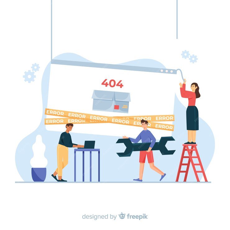
What Are the Benefits of a 404 Page?
A 404 page is the page that appears when a user tries to access a link they don’t have access. The 404 page is also called the “not found error” or “page not found.” It can be frustrating for users to see an error message when they click on a link, so ensuring your website has a good 404 page is vital.
Here are some of the benefits of having an excellent 404 page:
- User Care
- Users Can Get the Relevant Information
- Increases Conversion Rates for Your Website
1) User Care
It conveys that you care about your users. If you take the time to create a quality 404 page, it shows that you care about your customers and want them to have an easy experience using your website.
2) Users Can Get the Relevant Information
It tells users what happened and how they can fix it. A good 404 page will explain why there was an error and suggest ways the user can get back on track by clicking on other links in your site or searching for what they were looking for again using Google or another search engine.
3) Increases Conversion Rates for Your Website
It helps increase conversion rates because visitors trust your brand more if they see you’ve taken the time to create something unique for them.
404 Page: How to Keep Visitors on the Site?
A 404 page is a website’s way of handling errors when you try to access a page that doesn’t exist. It’s also an excellent opportunity to keep people on your site, which can be a challenge if they’re looking for something that isn’t there.
The best way to approach this situation is with a friendly tone, an explanation of what happened, and some suggestions for what they could do next.
For many people, the 404 page is their first impression of your site.
So, to keep visitors on the site and not make them leave, it’s important to design your 404 page correctly. Here are some easy steps for doing that.
Step 1: Don’t Panic
First and foremost, don’t panic! If your visitor gets a 404 error, there’s still hope; they might not realize it yet. That’s where you come in: let them know gently that something isn’t working as expected, but don’t make them feel like their whole day has been ruined.
Step 2: Explain What Went Wrong
Explain what went wrong in clear language that anyone can understand (don’t get too technical). It’s okay if this is longer than one sentence; people usually read through all the text on a web page before deciding whether they want to continue reading it.
Give them two options: click here to go back to the homepage or search for what they were looking for again using our search engine (if you have one).
Step 3: Describe the Problem

We’ve all been there: you click a link, and the page doesn’t load. Instead, you’re greeted with an unhelpful error message.
This can be incredibly frustrating for users, who often wonder what happened and why they see this strange page instead of what they expected. It’s even more frustrating when the user clicks on another link and gets the same error message again!
That’s why it’s so essential to design a 404 page that helps visitors understand what happened when they clicked the broken link and gives them a way to get back on track as quickly as possible.
Step 4: Speak In Simple Terms
This is especially important if you have an eCommerce site or something where users are trying to quickly find their way back home after clicking on an incorrect link or entering an incorrect URL (which happens all the time). You don’t want them to leave because they can’t understand you. So try speaking in simple terms.
Step 5: Give Resources to Help With the Problem
Make sure there’s an easy way for users who land on this page to find what they’re looking for and get back on track. If someone lands on your 404 page because they clicked a link in an email or text message, make sure there’s an option for them to click through and find the real thing. If someone lands here by accident, make sure you have a way for them to contact support so that they can figure out how they got here in the first place (and maybe even how they can avoid it again).
Don’t make it too long or too dull! People coming from Google might just be looking around Google, don’t send them back into the void without any information about their error or why they landed here.
Step 6: Maintain the Current Design of Your Website
404 pages are a necessary evil, but they don’t have to be a nightmare for your visitors.
The first thing you need to do is maintain the current design of your website. This will help keep the visitor on your site instead of sending them back to the search results page or another site.
Next, ensure you have an attractive and informative 404 page that tells visitors what they’ll find if they click through. The goal is to get people who have landed on a broken link back onto your site and are interested in what’s there. Don’t forget: none of this will work if you don’t have an accessible 404 page!
Related: Various Types of Website Designs and Their Primary Functions
Step 7: Fix Faulty Links
To keep your visitors on the site, you need to make it as easy as possible for them to find what they need. And one of the best ways to do this is by fixing faulty links.
This means you should check each page on your site regularly and ensure that all the links are working correctly. If there are any broken links, fix them as soon as possible. Otherwise, your site visitors might get frustrated and leave before they’ve found what they’re looking for.
Step 8: Consider User Error as an Opportunity for UX
An excellent way to start designing a more helpful 404 page is by considering user error as an opportunity for UX. If a user sees this page, it’s because they’ve tried to go somewhere on your website that doesn’t exist, so why not make it easy for them to find what they were looking for?
Consider using analytics data to determine your site’s most familiar user errors (you can also use heat maps if you have access to them). Use these insights to create a list of possible improvements or additions to your site structure. Include links to popular pages within the site so visitors can easily find their way back home.
Related: 21 Laws of UX for Building Successful Designs
Step 9: Reduce Clutter to Increase User Success Rates
The 404 page is a sensitive subject. It’s not good to keep users on the site, but it’s also not good to show them an error message and send them away.
So what should you do?
The answer is simple: reduce clutter and increase the user success rate.
In other words, ensure that when a user lands on a 404 page, they can navigate away from it quickly. Don’t make them hunt for links or buttons; ensure everything is where it needs to be.
Examples of Great 404 Pages
A 404 page is a great place to remind users that your site is still there and still has plenty to offer them. It’s also an excellent opportunity to highlight other content or products that might be relevant to their search.
The best way to design a 404 page is by keeping it simple and having fun with it. Here are some 404 page examples that will help you in creating yours:
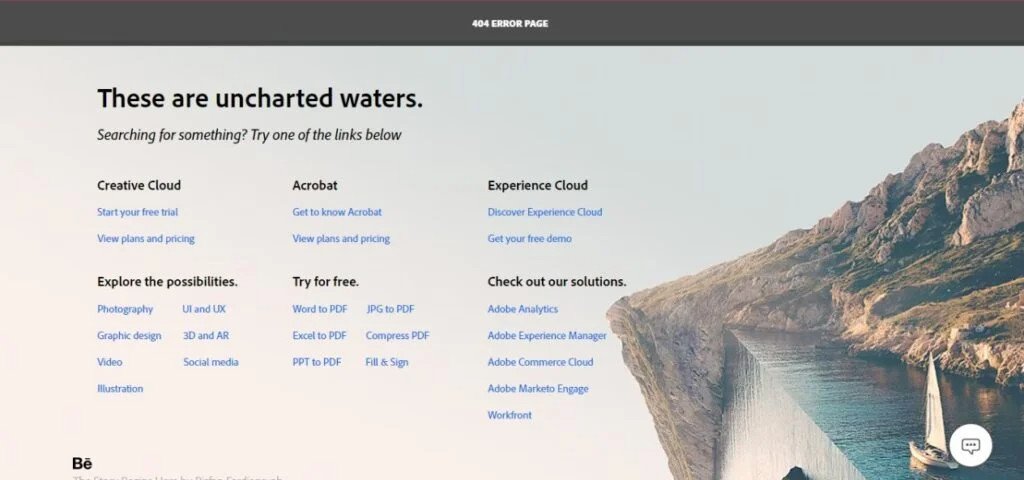
Adobe
When you click on a link to an Adobe product or service that is not found, you will be presented with this page. So what does Adobe do? They give them a friendly greeting: “These are uncharted waters.” with links to other parts of the site and an option to search for what they’re looking for. It’s simple, but it works!
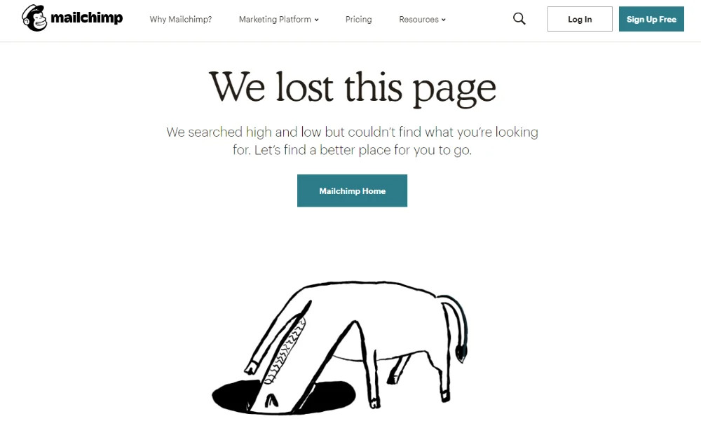
Mailchimp
Mailchimp’s 404 page is a surprisingly cute, user-friendly way to handle the error.
When you click on the link that says “We lost this page” with some additional info. On the site’s main landing page, you’ll be taken to a page with a picture of a horse (or a donkey, we’re still figuring it out).
The rest of the page will include a link to Mailchimp‘s homepage.
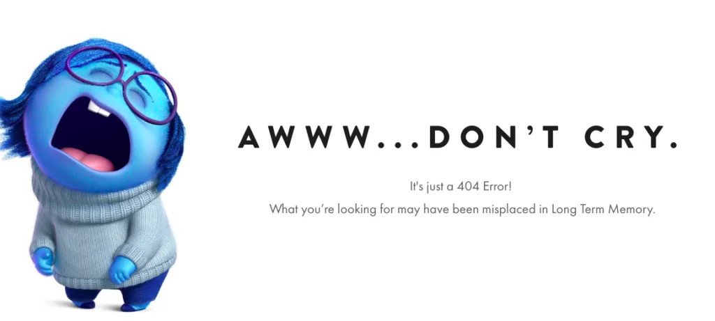
Pixar
Pixar‘s 404 page is a friendly mix of fun and utility. It will make you smile.
The Pixar 404 page features an animated 404 page template of a crying character from their film. It includes an error text that says, “Awww…Don’t Cry.” The idea behind this is to make users feel like they’re not alone in their frustration when they get stuck on an error page and to let them know that Pixar understands how frustrating it can be to have a link go dead.
LEGO
The LEGO 404 section is a place for users to get help when they’re having trouble with the site. It’s also a chance for LEGO to show off its sense of humor and creativity by using Emmet, the main character from “The LEGO Movie” series, as the face of the site.
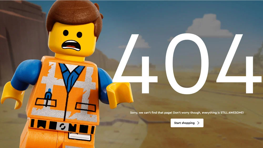
Even though it’s not a typical 404 page, it still manages to engage its visitors by keeping them engaged with something fun and quirky.
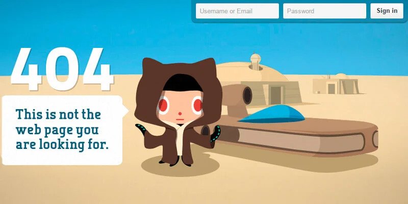
GitHub
The error message “This is not the webpage you’re looking for” is displayed alongside a “Star Wars” picture on the 404 page for the hosting and development website GitHub to appeal to its tech-savvy audience.
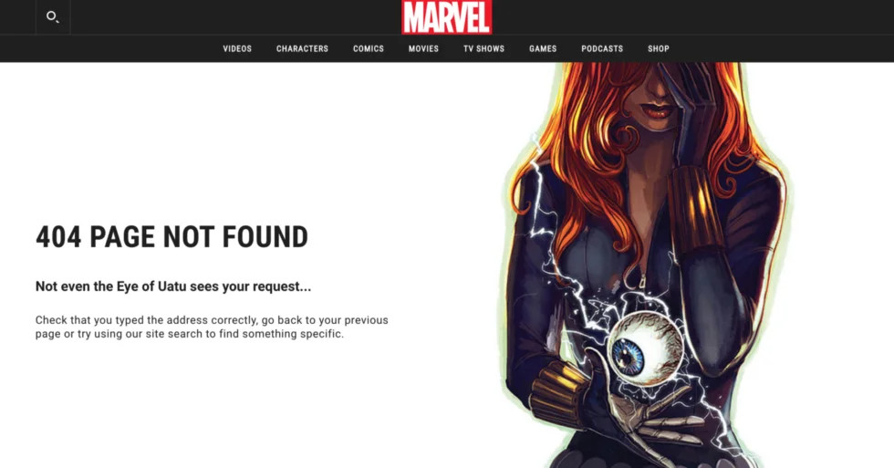
Marvel
The Marvel 404 page is one of the most exciting web pages on the internet. It’s fun and interactive, and it was created by the same people who brought you all those great Marvel comics!
The 404 page has several variations based on well-known characters or the brand’s comic books. For example, you can also see a comic character appear and say something like, “Not even the eye of Uatu sees your request…”
Bottom Line
We hope this post has helped shed some light on how you can design a 404 page, making them more functional, easier to use, and more aesthetically pleasing. We encourage you to try new techniques, have fun with them, and keep experimenting! With a bit of creativity and experimentation, you can easily design a personalized 404 page your visitors will love.
Over the past year or so, we’ve started to see more and more companies and websites coming up with their own unique 404 pages. They’ve tried all sorts of things, from funny to even silly (though still pretty cool), which we think is an excellent trend. We encourage you to try out different approaches to designing your 404 page, whether it’s a single design or a multi-page one. Just make sure that it’s clear to visitors what the problem is: Not Found, Page not Found, Error 404, etc., and that it gives visitors the option (and, if possible, easy access) to navigate to a new location on the site somehow.