Designing a web page, user interface, or user experience is never easy without the right tools. Luckily, designers nowadays have access to many tools that not only provide a wide range of features but are also easy to use.
Figma is one of the best design tools every designer must know about. If you are a beginner or a designer seeking to learn more about Figma, then in this blog, we will share very interesting Figma tips and tricks that will level up your designs.
About Figma
Let’s first brief you about what exactly Figma is and why it is so hyped up. Figma is a revolutionary graphic design and user interface editing app. It can be used for graphic design work, like wireframing for websites, prototyping, designing social media posts, and designing mobile app interfaces. You can start designing it from any platform or computer and work collaboratively with your teams. The best part is that it is free and straightforward to use.
Read here about the 10 Key Stages of the Mobile App Development Process.
Why Figma Is Important for Design?
Figma is an essential tool for design as it provides many benefits. It helps you work with teams and individuals collaboratively and create high-quality work. Figma makes it easier for designers to get feedback on each aspect of product design. It is not only best for design but also for creating prototypes of your products.
Figma is important for design because it has integrated tools for all creative process stages, increasing efficiency. As a designer, learning instruments like Figma to create market-competitive designs is essential. It will help you become proficient in UI/UX design basics.
Read this article to learn How to become a UI/UX designer.
15 Best Figma Tips and Tricks That You Must Learn
Stuck on a design problem? Don’t scratch your head because we have 15 best Figma tips and tricks to help you solve your design problems and use Figma more efficiently. Read through these fantastic suggestions and implement these in your design routine.
- Use the auto-layout feature
- Make use of the bar graph tool
- Switch Between Properties
- Use the smart selection feature
- Manage the file pages
- Take Help of the Scale Tool
- Time-Saving Tricks Through Spacebar
- Use a base unit of 8px
- Create Multiple Variants of Components
- Organize Your Design
- Rename Multiple Layers
- Master the keyboard shortcuts
- Unlock the Lock Objects
- Use an eyedropper to preview the color
- Use Content Reel Plugins
1- Use the Auto-Layout Feature
You might not know about Figma’s auto-layout feature, but it can give you so much convenience. Use this feature for dynamic resizing of your designs. Quickly add buttons, lists, models, etc, through auto-layout and add multiple margins and resizing rules. This will assist you in quickly adding intricate components and will reduce the need for tedious spacing edits.
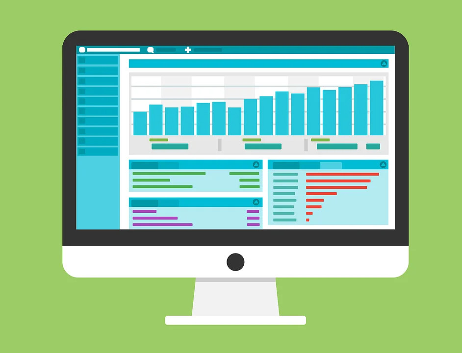
2- Make Use of the Bar Graph Tool
Many people don’t know about the bar graph tool, so we have added it to the list. This tool creates a minimalist bar graph arc that saves you time to develop arcs yourself.
3- Switch Between Properties
You can switch between properties with true/false logic or on/off labels. This trick makes switching between variants more convenient, and you can closely match different components in code.
4- Use the Smart Selection Feature
Figma’s innovative selection feature enables you to edit spacing in bulk. It also makes adjusting the spacing and aligning various objects pretty easily. Similar objects in Figma can automatically be grouped into a tidy list or grid, bulk spaced, and rearranged.
- Select related objects, choose the list or grid icon, and then drag the spacing to the right, left, up, or down to bulk modify spacing.
- To change the object placement, choose related objects, then click and drag a dot inside a single object to a different spot.
5- Mange the File Pages
Having to look for specific design components is a time-consuming and exhausting task. But you can solve this problem by organizing your file pages in Figma. It makes navigating and maintaining them easy. For design and documentation, each page should have a well-defined name.
6- Take Help of the Scale Tool
The scaling tool can help you select all the objects you want to scale and achieve a pixel-perfect design. Select all the objects you want to scale and then drag by holding the K key on your keyboard. It will scale all your components and maintain their propositions.
7- Spacebar Time-Saving Tricks
Believe it or not, the spacebar also comes in handy when using Figma. To expand the cursor selection, drag the selection box and press and hold the spacebar. You can also set aside space as you sketch a pattern so that you can reposition the object later. Pressing the spacebar will cause Figma to immediately transfer the object into an auto frame or layout if that is insufficient. It can also be used in place of nesting.

8- Use a Base Unit of 8PX
Holding down Shift and an arrow key will activate the nudge; to change the amount, go to Menu > Preferences > Nudge amount > 8.
For various reasons, using a base unit of 8px is commonly advised. This base unit must be consistently used for all scaling and spacing tasks. Changing the “nudge amount” in Figma from 10px to 8px can simplify this for you and your entire team. In this manner, each time you move or resize an object, you will do so in 8-point increments.
9- Create Multiple Variants of Components
Here’s another tip! You can use the base components more effectively by building and maintaining components with different versions. Each variant will have a copy of its nested base component that has been rewritten to produce a new state. This guarantees perfect consistency and makes mass updating relatively simple.
10- Organize Your Design
You must have a well-organized and clear design. Click the grid icon in the corner after selecting several elements in the table to arrange your design. By equating all gaps between objects, you can drag and rearrange things and change their arrangement.

11- Rename Multiple Layers
Another thing you can do to maintain and organize your design is to rename multiple layers. This job is much quicker with Figma’s “Rename Layers” paradigm, which enables you to rename layers in bulk. Each layer’s name can be changed to be the same, to include a number suffix, to give distinct names a prefix, or to change just a portion of the layer’s name.
Go to Right-click Layers > “Rename” to get the Rename Layers model.
12- Master the Keyboard Shortcuts
Keyboard shortcuts come in handy instead of using mouse actions. Working in Figma is considerably faster and more effective because practically any activity can be started using a keyboard shortcut. Therefore, keep learning every day about keyboard shortcuts that can be used in Figma.

13- Unlock the Lock Objects
CMD (CTRL) + can be used to unlock the locked objects. There are a lot of useful quick applications for CMD (CTRL) + / that can speed up your workflow and save you a lot of time. Take our advice and look at what’s on the menu if you aren’t using it. Change the typeface and unlock everything.
14- Use Eyedropper to Preview a Color
Don’t forget about using the eyedropper tool to preview any color. Choose the element you want to change. To access the eyedropper tool, press the I key on your keyboard. To sample a color from the canvas, hover over it. The magnifier window lets you view the sampled pixel’s color and hex code.
15- Use Content Reel Plugins
Our last tip for you is to use content reel plugins in Figma. You can create unique material with Content Reel and share it with other Figma users. To find published collections of text strings, graphics, and icons, browse or search the content.
Read this article to learn about UI/UX design best practices.
Best Features of Figma
Designing a website is easier now that we have tools like Figma that have a lot of features in just one platform. There are many great features of Figma that you might not know about yet. Therefore, we have added a bonus list of the best features of Figma that can change how you design products. Read the list below to learn about Figma’s best features for the website and UI/UX design:
1- Swap Menu
Figma introduced a push-style menu option in 2020. With this push-style menu structure, designers can easily swap through the components. You can swap between team libraries through a single drop-down option.
2- Inspect Tab
The Code Panel in Figma is now called the Inspect tab. With this feature, designers and collaborators can get the values and codes of the design. Team members can also clip contents, typographies, variants, colors, and borders from this tab.
3- Variants
Figma component library is also called variants. This tool can manage your components by reducing duplicate iterations and grouping copies together for a library. It makes navigation easier for teams working on web design projects.
4- Design Review
Design review by team members and stakeholders is essential to any web design project. Thanks to Figma, you can do it with just a simple conference. All team members can work on a single screen and give reviews, add comments, and resolve these issues with the Figma design frame.
Also read: Dark Mode vs Light Mode: What’s Better for UX
5- Files and Plugins Library
Figma provides convenience for working collaboratively. Its components files provide resources like remote design print, templates, open figure illustration library, and UI web design kit. Figma plugins also provide developers with many benefits. There are around 50 unique Figma plugins available for content creators. You can also share private plugins between team members through Figma.
Final Thoughts
In this blog, you learn some advanced Figma tips and tricks that will be useful in the future. With the competition in design fields increasing daily, it is essential to stay abreast of basic design tools. Figma is a straightforward and easy-to-learn tool where you can create top-tier designs with basic knowledge of some Figma tips and tricks.
You can also learn other tools like Adobe Illustrator, Sketch, Affinity, and Procreate. But starting with Figma is uncomplicated compared to other design tools, and Figma is also free. It is a beginner-friendly tool, so you won’t find learning complex. We hope these Figma tips and tricks will be helpful for you.
FAQs
What Is the Best Design Tool?
According to popular opinion in the graphic design community, Adobe Photoshop, Figma, and Sketch are some of the best design tools. All of these are very popular for UI/UX design.
Is Figma Easy to Learn for Beginners?
Figma’s interface makes it easy to learn for beginners as well as natives. Creating a prototype or a final product is so simple on Figma. Plenty of tutorials are available on youtube to learn how to use Figma as a beginner.
Which One Is Better: Canva or Figma?
Figma and Canva serve best for different purposes. Simply put, Canva is a better option for creating infographics, flyers, social media posts, and presentations. But Figma works better on the prototype, UI, and UX projects.
