If you’ve ever stared at a messy Figma file or spent way too long deciding what size a button should be, you’re not alone.
Designing a digital product comes with a thousand tiny decisions. And if you’re part of a fast-moving startup or small team, those decisions can quickly snowball into inconsistent screens, scattered design files, and a lot of unnecessary back-and-forth.
That’s where UI kits come in. They’re like a shortcut to clean, consistent, and efficient design. But what exactly is a UI kit? How do you use one? And do you really need one for your project?
In this blog, we’ll give a clear explanation of what a UI kit is, how it helps, and why your team might want to start using one.
What Is a UI Kit?
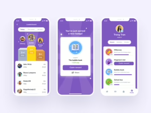
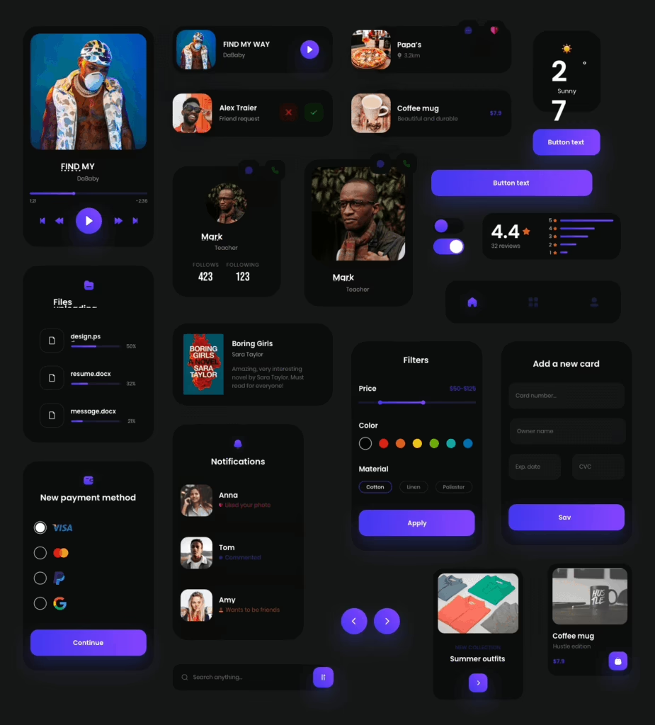
Let’s start with the basics. A UI kit, or User Interface kit, is a collection of pre-made design elements and components that are used to build user interfaces for websites, apps, and other digital products.
Think of it as a ready-to-go toolbox filled with all the visual building blocks you need to design your product. Instead of designing every single screen from scratch, you can simply grab components like buttons, form fields, icons, or card layouts from your kit and drop them into place.
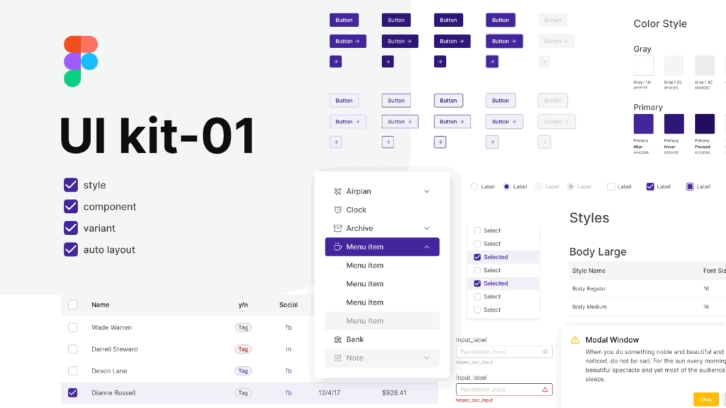
A typical UI kit includes:
- Buttons (primary, secondary, disabled, etc.)
- Typography styles (headers, subheaders, paragraph text)
- Color palette with hex codes and usage guidelines
- Icons and illustrations
- Input fields, dropdowns, and checkboxes
- Modals, alerts, and tooltips
- Layout grids and spacing rules
These kits are usually created in tools like Figma, Sketch, or Adobe XD, making them easy to use, customize, and share with your team.
Why UI Kits Matter (Especially for Startups and Growing Teams)
When you’re building a product quickly, decisions around layout, typography, and spacing can become a bottleneck. Without a system in place, you might end up with:
- Inconsistent design across different pages or features
- Developers building components that don’t match the design
- Designers spending time on repetitive tasks
- Confusion among team members about what the “correct” version of a component is
A UI kit solves all of this by acting as a single source of truth for your product’s visual elements. Here’s how:
1. Speeds Up the Design Process
Designers don’t need to start from scratch every time they design a new screen. They can simply use components from the kit, saving hours (or even days) of repetitive work.
2. Promotes Consistency
Every screen, feature, and interaction feels like part of the same product. That means users have a smoother, more cohesive experience.
3. Reduces Design Debt
When your product grows without a consistent design foundation, small inconsistencies pile up over time. A UI kit helps prevent that by keeping design aligned from the start.
4. Helps Developers Build Faster
When developers have access to a clear, consistent set of design components, they can code with confidence—no more guessing about spacing or font sizes.
5. Makes Onboarding Easier
New team members, whether designers or developers, can get up to speed quickly. The kit shows them exactly how things are supposed to look and function.
What’s Included in a UI Kit? A Closer Look
Let’s dig into what you’ll typically find inside a complete UI kit.
Typography
Typography styles help you define a hierarchy in your product. Instead of picking random font sizes or weights, the kit outlines all your text styles, like H1, H2, paragraph, and caption, along with details like font family, size, color, and line spacing.
Buttons
Most kits include multiple button types: primary, secondary, outline, ghost, and disabled states. Each button comes with hover states, active states, and guidelines for when to use each one.
Color Palette
A good UI kit has a structured color palette with primary, secondary, accent, and neutral colors. It also defines usage, like which colors are used for backgrounds, text, borders, and feedback states (error, success, warning).
Components and Controls
This includes common UI elements like input fields, dropdowns, radio buttons, toggles, and sliders. These are essential for building interactive products and forms.
Icons and Visual Elements
Many kits include a library of icons for navigation, actions, and system statuses. These icons are usually optimized to work at various sizes and integrated into the overall visual style.
Layout and Grid Systems
A UI kit often includes spacing guidelines and layout grids to help maintain alignment and balance across different screen sizes.
Cards, Lists, and Containers
Reusable content blocks like cards or list items save time and ensure structure across repeated components.
UI Kit vs. Design System: What’s the Difference?
If you’ve heard of design systems, you might be wondering how they compare to UI kits. While they’re related, they’re not the same thing.
Here’s the simple breakdown:
- A UI kit is a collection of visual components, like a starter pack for building your product’s interface.
- A design system includes everything in a UI kit, plus documentation, usage guidelines, design principles, accessibility standards, and sometimes even code snippets.
Think of a UI kit as a lightweight version of a design system. It’s perfect for startups and early-stage products that need structure without over-complicating things. Once your product scales and your team grows, transitioning to a full design system makes sense.
How to Use a UI Kit in Your Workflow
A UI kit becomes most valuable when it’s integrated into your team’s everyday workflow. Here’s how different roles can use it:
Designers
Use the UI kit as a starting point for wireframes, mockups, and high-fidelity designs. Instead of redrawing components, simply duplicate and customize the existing ones.
Developers
Refer to the kit for spacing, typography, and component states. If the kit is linked to a coded design system (like Storybook), developers can implement components directly in code.
Product Managers and Founders
Use the UI kit to quickly visualize ideas, give feedback on design work, and keep everyone aligned on how the product should look and feel.
Should You Use a Pre-Made UI Kit or Create a Custom One?
There’s no definite answer. It depends on your product stage, team size, and priorities.
Pre-Made UI Kits
There are many pre-built UI kits available online. These can be great for:
- Prototyping new ideas
- MVPs or early-stage startups
- Hackathons or temporary projects
- Teams without a designer
Pre-made kits are fast, affordable, and often beautifully designed. You can find free kits on platforms like Figma Community or premium ones on UI8, Envato, and Creative Market.
However, pre-made kits usually follow generic branding and styles. If you want your product to stand out or reflect your brand’s identity, a custom kit is a better option.
Custom UI Kits
If you’ve already validated your idea and are looking to scale or stand out in the market, a custom UI kit is worth investing in.
Custom kits:
- Reflect your brand identity (colors, typography, voice)
- Align with your specific use cases and product flows
- Scale better with your team as you grow
- Make your product more memorable and user-friendly
At Hapy Design, we build UI kits tailored to your brand and your users, so you don’t have to settle for something off-the-shelf.
How Hapy Design Builds UI Kits
We don’t believe in one-size-fits-all design. At Hapy Design, our approach to building UI kits is rooted in clarity, function, and speed.
Here’s what makes our kits different:
- Built for real use, not just pretty mockups. We think about how developers and teams will actually use the kit.
- Designed with collaboration in mind. Our kits are organized, labeled, and easy to update across design and dev tools.
- Custom to your brand. We don’t reuse the same kit across clients. Each UI kit is designed to match your product’s voice and personality.
We also work directly with your team to ensure handoff is smooth and implementation is seamless.
Conclusion
A UI kit is one of those tools that quietly makes everything better. It’s not flashy or complex, but it brings structure, speed, and polish to your product design process.
If you’re tired of design inconsistencies, slowed-down development, or endless Slack threads about which font size to use, it might be time to invest in a UI kit.
And you don’t have to figure it out alone. Whether you’re just getting started or looking to level up your existing design system, Hapy Design can help you build a UI kit that’s easy to use, easy to scale, and completely yours.
Let’s Build a UI Kit
At Hapy Design, we create UI kits that don’t just sit in your Figma file, they power your product.
Need one for your next project or just want to chat about how a UI kit could help your team? We’re happy to talk.