Typography is one of the most powerful tools in UX design. It shapes how users interact with content, influences their emotional responses, and guides their navigation through interfaces.
Whether you’re designing a website, app, or digital product, typography can either enhance or disrupt the user experience.
In this post, we’ll explore typography tips, to simplify user journeys, dive deep into how typography impacts UX, and show you how to make typography work for you.

What is Typography in UX?
Typography is more than just choosing fonts for your website or app. In UX design, it involves selecting typefaces, font sizes, line spacing, colors, and arrangements that make content easy to read, accessible, and pleasant to interact with.
Typography in UX is all about creating a visual environment where users can absorb information quickly, understand your message, and easily navigate your interface.
Good typography sets the tone for the entire user experience, while bad typography can make users feel frustrated, lost, or even abandoned.
Think about it: When was the last time you struggled to read text because the font was too small, too fancy or lacked contrast? Bad typography doesn’t just affect aesthetics; it affects usability, accessibility and user satisfaction.
Key Role of Typography in UX
- Guides the User Journey: Typography directs attention. The hierarchy, alignment, and spacing of text help guide users through your content, ensuring they engage with key information at the right time.
- Enhances Readability and Comprehension: Proper typography makes content easier to read and understand, which keeps users engaged.
- Supports Brand Identity: Typography helps establish a brand’s visual language. The fonts you choose can communicate personality and professionalism and evoke specific emotions.
By understanding these basics, you’ll be ready to dive into the nuances of typography in UX design and learn how it can help simplify your users’ journey.
Key Elements of Typography in UX
Now that you understand what typography in UX is, let’s break down the essential elements that contribute to a great user experience.
1. Typefaces and Fonts

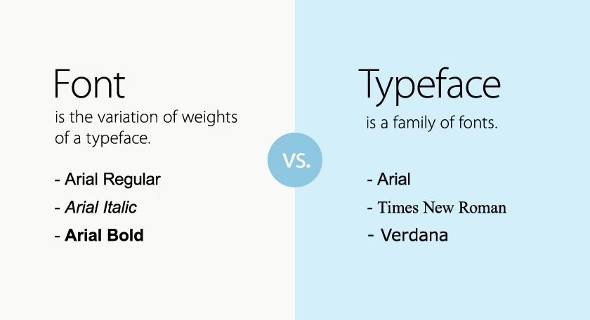
Fonts play a vital role in creating a comfortable reading experience. Choosing the right typeface is not just about aesthetics—it’s about ensuring clarity, legibility, and usability. Different typefaces convey different moods and tones, which can influence how users feel about your product.
- Serif vs. Sans-Serif: Serif fonts (with small lines or strokes at the end of characters) are traditional and can evoke a sense of formality. Sans-serif fonts (without those lines) are modern, clean, and easier to read on screens.
- Avoiding Overuse: While using multiple fonts is tempting, too many can create a chaotic, hard-to-read experience. Stick to one or two complementary fonts throughout your design.
- Readability: Always prioritize readability over decoration. Fancy fonts might look good on posters, but they’re often challenging to read in body text.
2. Font Size

Font size is crucial for ensuring content is legible across various devices. Too small, and users will struggle to read; too large, and it can appear cluttered or unbalanced.
- Body Text: For body text, the font size should typically be around 16px for comfortable reading on web and mobile devices.
- Heading Sizes: Headings should stand out but remain proportionate to the body text. A good rule of thumb is to have headings at least 1.5 to 2 times larger than the body text.
3. Spacing (Leading and Kerning)

Line height (or leading) refers to the vertical spacing between lines of text, while word spacing (or Kerning) refers to the gap between individual characters and words.
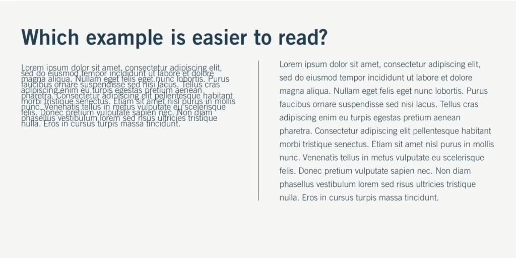
- Line Height: A line height of 1.5x the font size is typically optimal for readability. Too little space between lines can make the text feel cramped, while too much space can break the flow.
- Word Spacing: Ensure that there’s enough space between words for clear separation. Words that are too close together can confuse readers.
4. Color Contrast

Typography needs to stand out, but it must also be accessible. Color contrast plays a key role in making text readable, especially for users with visual impairments.
- High Contrast: Make sure there’s a balanced contrast between text and background. Black text on a white background is the most readable, but it’s also important to balance it with your design’s color scheme.
- Accessibility: Follow the WCAG (Web Content Accessibility Guidelines) for color contrast. For body text, aim for a contrast ratio of at least 4.5:1 with the background.
Also read: Color Psychology in UX: How They Influence User Behavior
The Psychology of Typography in User Journeys
Typography isn’t just about functional design; it also has a psychological effect on users. Fonts influence how users feel about your product and can even affect their decision-making process.
1. Fonts and Emotional Response
Different fonts evoke different emotions. For example, a bold, sans-serif font might feel modern and straightforward, while a cursive, serif font might feel more elegant or playful. The psychological impact of typography is essential to consider when designing your user journey.
- Clean and Simple: Sans-serif fonts (like Arial or Helvetica) are perceived as modern, professional, and straightforward. They are easy to read, making them ideal for digital interfaces.
- Elegant and Classic: Serif fonts (like Times New Roman or Georgia) are often seen as more traditional, serious, or formal. They work well for publications and brands that want to convey trust and authority.
- Playful and Friendly: Rounded fonts or script fonts can give a more casual and approachable feel, which is perfect for apps or websites that want to feel friendly and fun.
2. Trust and Readability
Readable typography establishes trust. When users can easily read and navigate content, they’re more likely to stay on your site, engage with your product, and ultimately convert. Typography builds the bridge between your users and your content, and a poor typography choice can immediately create distrust.
Typography Tips for Simplifying User Journeys
Now that we’ve covered the elements and psychology of typography, let’s discuss some best practices to simplify user journeys.
1. Hierarchy and Scannability

Users don’t read every word on a webpage. They scan. By using typography to create a clear hierarchy, you guide users to important information quickly.
- Headings and Subheadings: Use headings and subheadings to break text. Make sure they’re larger and bolder than body text so users can quickly find what they need.
- Bullet Points and Lists: For key information, consider using bullet points or numbered lists. This helps users easily scan for what’s most important.
2. Consistency
Consistency in typography is key to creating a smooth user experience. When your fonts, sizes, and spacing are uniform, users feel more comfortable navigating your interface.
- Type System: Develop a type system or style guide for your project. This ensures that headings, subheadings, body text, and calls-to-action all have their designated styles.
- Cross-Platform Consistency: Make sure your typography remains consistent across devices (desktop, tablet, mobile). Text that looks great on a large screen should also be readable on smaller screens.
3. Whitespace

Whitespace is the space between elements. It’s not just a design trend—it’s essential for usability. Proper use of whitespace can make your design feel clean, uncluttered and easy to follow.
- Line Spacing: Adequate line spacing makes text easier to read.
- Margins and Padding: Ensure that elements have enough space around them to avoid a cramped, chaotic design.
4. Responsive Typography
Today’s users interact with content on multiple devices—phones, tablets, desktops, and more. Your typography should adjust accordingly.
- Fluid Typography: Consider using responsive typography techniques that automatically adjust font sizes based on the user’s screen size.
- Testing Across Devices: Always test your typography on various devices to ensure readability and usability.
Typography for Accessibility
Accessibility is an integral part of UX design. Your typography choices should accommodate users with visual impairments or reading difficulties.
1. Follow WCAG Standards
Web Content Accessibility Guidelines (WCAG) offer detailed recommendations on how to make web content more accessible. These include font size, color contrast, and line spacing guidelines.
2. Use Readable Fonts
Avoid overly decorative fonts for body text. Stick to simple, clear fonts that are legible at various sizes.
3. Tools for Accessibility Testing
Use tools like Contrast Checker and Axe to evaluate your typography’s accessibility. These tools can help you ensure that your content is easily readable for all users.

Common Typography Mistakes in UX
Even seasoned designers make typography mistakes. Here are a few common errors and how to avoid them.
1. Overusing Decorative Fonts
While decorative fonts can look appealing in headings or logos, they can quickly become hard to read. Use them sparingly, and reserve them for emphasis or titles.
2. Poor Contrast
Poor contrast between text and background can make content difficult to read, especially for users with visual impairments. Always ensure there’s enough contrast to meet accessibility standards.
3. Inconsistent Fonts
Using too many different fonts or font sizes can create a disorganized experience. Stick to a consistent typography system to maintain visual harmony.
Typography Trends in Modern UX Design
As with any design field, typography in UX design is always evolving. Here are some current trends to consider in 2025:
1. Minimalist Typography
Minimalism continues to dominate UX design, and typography plays a crucial role. Simple, clean fonts with plenty of whitespace are becoming increasingly popular for digital products.
2. Variable Fonts
Variable fonts allow designers to create flexible text that adapts to different screen sizes, user preferences, or device types. These fonts are more efficient and can reduce page load times.
3. AI-Driven Typography
AI tools are emerging that can help designers choose the best typography based on user behavior and preferences, making typography even more personalized.
Case Studies: Typography in Action
Let’s take a look at a few examples of websites or apps that excel at typography.
- Apple: Apple’s use of minimalist sans-serif fonts and consistent spacing makes its product pages simple and easy to navigate.
- Medium: The popular blog platform uses large, readable fonts with plenty of line height to ensure a smooth reading experience.
- Spotify: Spotify combines typography with imagery and iconography to create an engaging, user-friendly interface.
Conclusion
Typography is one of the most impactful aspects of UX design. It guides users, enhances readability, and creates a seamless user journey. By applying the tips and practices outlined in this post, you’ll be able to design digital experiences that are not only visually appealing but also user-friendly and accessible.
If you’re ready to elevate your digital product’s design and improve your users’ experience, check out Hapy Design for tailored solutions that simplify user journeys through effective typography and design.
