Dark mode vs light mode. It’s the eternal UI debate. Some users swear by the sleek, modern look of dark mode, while others argue that light mode is easier on the eyes and better for readability.
As UX designers, it’s our job to move beyond personal preferences and dig into the usability, accessibility, and design implications of both.
So, what’s really better for UX? The short answer: It depends. Let’s break it down.
1. Understanding Dark Mode and Light Mode
What is Dark Mode?
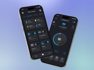
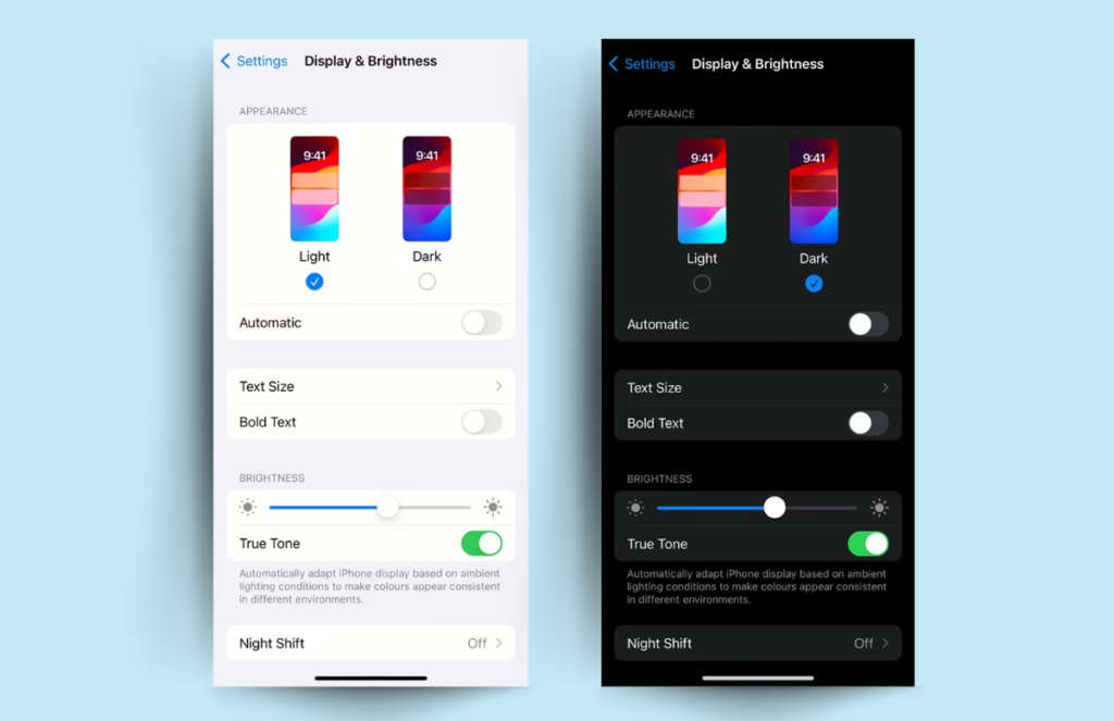
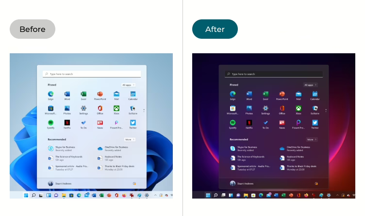
Dark mode uses a dark background with light-colored text and UI elements. Instead of the traditional black text on a white screen, it flips the contrast. Dark mode is often associated with a modern, high-tech look and is popular in apps used for reading, coding, or gaming.
What is Light Mode?
Light mode is the classic UI choice, with dark text on a light background. It’s been the default since the early days of digital screens and is widely used in everything from websites to mobile apps and software interfaces.
A Brief History of the Modes
Light mode became the standard because early computer screens mimicked paper, making it an easy transition for users. Dark mode gained popularity as an alternative, especially as OLED and AMOLED screens became more common, allowing for better energy efficiency and contrast control.
2. The UX Benefits of Dark Mode
Dark mode isn’t just an aesthetic choice; it has real benefits for users in certain contexts.
a) Reduced Eye Strain (in Low-Light Environments)
One of the biggest arguments in favor of dark mode is that it reduces glare and eye strain in dim environments. Staring at a bright white screen in a dark room can cause discomfort, which is why dark mode is great for night-time browsing, gaming, or late-night work sessions.
b) Battery Efficiency (for OLED & AMOLED Screens)
Dark mode can actually extend battery life on devices with OLED or AMOLED screens. These screens don’t need to light up black pixels, meaning less power consumption when dark mode is enabled.
c) Aesthetic Appeal & Modern Look
Dark mode just looks cool. Many designers and developers prefer it because it gives interfaces a sleek, high-tech feel. It’s no surprise that apps like Twitter, Instagram, and macOS have embraced it.
d) Increased Focus for Certain Users
For users working in high-contrast environments, dark mode can reduce distractions and improve focus. This is why many coding environments, like VS Code and Sublime Text, default to dark themes.
3. The UX Benefits of Light Mode
While dark mode has its advantages, light mode remains the most widely used UI choice. Here’s why:
a) Better Readability (Especially for Long-Form Content)
Black text on a white background is easier to read for extended periods. That’s why websites, books, and documents almost always use light backgrounds—it’s just easier on the eyes.
b) More Familiar & Universally Accepted
Light mode has been the default since the early days of computing. Most users are comfortable with it, which makes transitioning between different apps and websites seamless.
c) Improved Visibility in Bright Environments
If you’re using your phone outside on a sunny day, dark mode can make text difficult to read. Light mode works better in bright environments because of the way light reflects off the screen.
d) Accessibility Considerations
For some users with visual impairments, light mode provides better contrast and legibility. People with astigmatism, for example, often struggle with dark mode because of the way light text can appear blurry against a dark background.
4. The Downsides of Each Mode
Dark Mode Cons:
- Harder to read long-form text.
- Can reduce legibility for users with astigmatism.
- Poor visibility for certain colors, especially bright ones.
Light Mode Cons:
- Can cause eye fatigue, especially at night.
- Higher energy consumption on OLED/AMOLED screens.
- Can feel harsh in dimly lit environments.
5. Choosing the Right Mode
Choosing the right mode isn’t just about aesthetics—it’s about understanding who your users are and how they interact with your product.
Age & Vision Considerations
- Older users may find dark mode harder to read due to contrast sensitivity.
- Younger users, especially Gen Z and millennials, tend to prefer dark mode for its modern aesthetic.
User Behavior
- Night-time readers and gamers favor dark mode to reduce eye strain.
- Professionals in bright office environments often prefer light mode.
Industry-Specific Preferences
- Developers and designers often use dark mode in coding environments.
- News and reading platforms typically stick to light mode for readability.
Cultural & Regional Differences
- Some cultures associate light backgrounds with clarity and trustworthiness.
- Dark mode is often more popular among tech-savvy users.
6. When to Use Dark Mode vs. Light Mode
Context-Based Design
Not every app needs dark mode, but some benefit from it. Social media apps, coding platforms, and media apps often include it, while productivity tools and e-commerce sites tend to stick with light mode.
User Preference & Customization
The best UX decision? Let users choose. Giving users the option to switch between modes ensures they can pick what works best for them.
Industry Examples
- Twitter, Instagram, and macOS have fully embraced dark mode.
- Google Docs, Medium, and news websites generally stick with light mode.
7. Best Practices for Designing in Dark & Light Mode
a) Contrast & Readability
Avoid pure black (#000000) and pure white (#FFFFFF). Instead, use softer shades like dark gray (#121212) and off-white (#F5F5F5) for better readability.
b) Color Accessibility
Ensure sufficient color contrast, especially for users with visual impairments. Test with tools like WCAG color contrast checkers.
c) Consistency
Keep UI elements recognizable across both modes. Users shouldn’t feel like they’re using two different apps when switching modes.
d) Testing
A/B testing is your best friend. Gather user feedback to determine which mode works best for your audience.
Conclusion
So, which mode is better for UX?
The answer is: it depends. Each mode has strengths and weaknesses, and the best approach is to provide users with the flexibility to choose what works for them.
At the end of the day, good UX is about giving users control. Whether you’re designing an app, a website, or a digital product, always consider accessibility, usability, and real-world user behavior.
Want to create a seamless dark and light mode experience?
Hapy Design can help. Let’s create a UI that looks great in any mode. Contact us today.