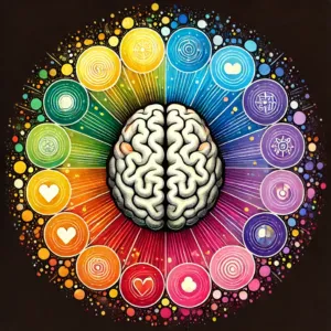
Color is often an overlooked yet incredibly powerful tool in UX design. When used effectively, it can elevate the user experience, guide behavior, and even create a lasting emotional connection. Color can influence how users perceive your brand, make decisions, and interact with your site or app. It’s not just about choosing aesthetically pleasing colors, it’s about understanding how they impact human emotions and behavior.
In this blog, we’ll explore the fascinating world of color psychology in UX design. You’ll discover how different colors can influence user behavior, help you make informed design decisions, and ultimately create better user experiences.
The Science Behind Color Psychology
1- What is Color Psychology?
Color psychology is the study of how colors affect human emotions, thoughts, and behaviors. In the context of UX design, it refers to how the use of color can influence users’ perceptions of your brand and guide their actions. Different colors evoke different feelings and responses. For example, red may trigger excitement or urgency, while blue can create a sense of trust and calmness.
Understanding the psychological effects of color allows designers to craft experiences that align with users’ emotional states and needs. This alignment can influence everything from how users engage with content to their likelihood of completing a conversion action, such as signing up for a newsletter or making a purchase.
2- The Role of Color Perception in UX
Color perception is highly subjective and can be influenced by various factors, including personal experiences, cultural backgrounds, and even lighting conditions. This means that the psychological impact of a particular color might not be the same for everyone. For example, while blue is often associated with trust in Western cultures, it might have a different meaning in other regions.
When designing for a global audience, it’s crucial to consider these varying perceptions. But even within a single demographic, subtle differences in color perception can have significant impacts on how users interact with your design.
3- Why Color Matters in UX Design
Color plays an essential role in creating an emotional connection between your users and your brand. It can convey your brand’s personality, influence how users feel, and even direct their actions. Moreover, the right use of color can improve readability, highlight key areas of your design, and make navigation more intuitive.
Ultimately, color in UX design is about balance — using colors that align with your brand and messaging while also making sure they create a smooth, intuitive user experience.
The Psychological Effects of Color
1- Red: Energy, Urgency and Passion

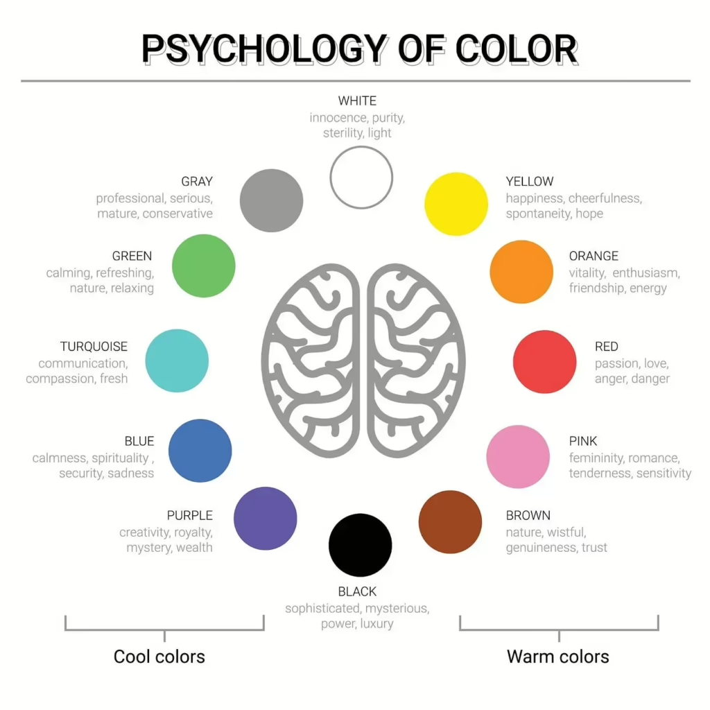
Red is often associated with excitement, energy, and urgency. This makes it an excellent choice for CTAs (Call-to-Action buttons), sale alerts, and other elements designed to encourage immediate action. Red can also evoke strong emotions, including passion, power, and even danger, which is why it’s often used to draw attention to important notifications or warnings.
When used appropriately, red can make users feel energized and motivated to take action, such as clicking a button or making a purchase. However, too much red can be overwhelming, so it’s important to balance it with other colors to avoid creating a sense of anxiety.
Example: E-commerce websites often use red for limited-time offers or promotions to create a sense of urgency, encouraging users to act quickly.
2- Blue: Trust, Calm and Security

Blue is one of the most universally liked colours and is often associated with trust, calmness, and security. It’s commonly used by brands that want to convey professionalism and reliability, such as tech companies, healthcare brands, and financial institutions. Blue has been shown to evoke feelings of serenity and can even lower heart rates, making it ideal for industries where trust is paramount.
By incorporating blue into your design, you can create a sense of comfort and security that encourages users to stay longer on your site and complete transactions.
Example: Tech giants like Facebook, LinkedIn, and PayPal use blue to convey trustworthiness and reliability.
3- Yellow: Optimism, Caution and Attention

Yellow is often associated with optimism, warmth, and attention. It’s a bright, attention-grabbing color that can create a sense of positivity. However, yellow is also the color of caution (think traffic lights and warning signs), so it’s important to use it strategically. When used in moderation, yellow can make your design feel friendly and welcoming.
Because of its eye-catching nature, yellow is a great choice for CTAs or elements where you want to draw attention. However, too much yellow can be overwhelming, so it should be paired with other colors to balance its impact.
Example: Brands like McDonald’s and IKEA use yellow to evoke feelings of warmth and energy, making their designs feel approachable.
4- Green: Growth, Health and Balance

Green is often linked to growth, nature, and balance. It’s commonly used by brands in the wellness, sustainability, and financial sectors to convey a sense of health, stability, and prosperity. Green is also known for its calming effects, making it an excellent choice for creating a relaxing and peaceful atmosphere in your design.
Whether you’re designing a health-related website or a sustainable brand’s online presence, green can help convey trust, wellness, and harmony with nature.
Example: Brands like Whole Foods and Greenpeace use green to communicate their commitment to sustainability and health.
5- Orange: Creativity, Enthusiasm and Warmth

Orange is an energetic and creative color, associated with enthusiasm, fun, and warmth. It’s often used by brands looking to evoke a sense of excitement and creativity, such as in creative agencies, e-learning platforms, or entertainment websites. While orange is not as aggressive as red, it still packs a punch and can drive action.
Example: Creative platforms like SoundCloud and e-learning sites often use orange to make their designs feel dynamic and engaging.
6- Purple: Luxury, Creativity and Mystery
Purple is often associated with luxury and sophistication. It’s a color that evokes a sense of exclusivity and mystery. Because purple is less commonly used than other colors, it can stand out and create a sense of uniqueness for your brand.
If you’re looking to convey elegance or creativity, purple is a great choice. However, it should be used in moderation to avoid overwhelming users.
Example: High-end brands like Rolex and creative companies often use purple to signal luxury and artistic flair.
7- Black: Sophistication, Elegance and Authority

Black is a timeless color associated with sophistication, authority, and elegance. It’s commonly used in high-end brands and minimalist designs to create a sleek, modern aesthetic. Black can also serve as a neutral backdrop, allowing other colors to pop and grab attention.
When used effectively, black conveys power, luxury, and professionalism, making it perfect for premium products or services.
Example: Fashion brands like Chanel and tech companies like Apple use black to convey elegance and sophistication.
8- White: Simplicity, Purity, and Cleanliness

White represents purity, simplicity, and cleanliness. It’s mostly used in minimalist designs to create a sense of space and clarity. White is also a great backdrop for showcasing content, as it allows text and images to stand out.
In UX design, white space (or negative space) is crucial for creating clean, easy-to-navigate interfaces. By using white effectively, you can make your design feel uncluttered and approachable.
Example: Healthcare websites and e-commerce checkout pages often use white to create a clean, simple environment that encourages trust.
Color Psychology in UX: Applications and Strategies
1- Creating Visual Hierarchy with Color
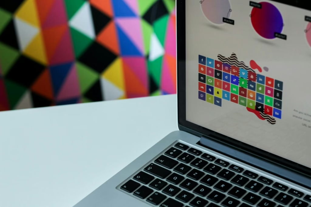
Color plays a key role in establishing visual hierarchy. By using color strategically, you can guide users’ attention to the most important elements on a page, such as headings, buttons, and CTAs. High-contrast colors are particularly effective for drawing attention to specific areas, while subtle variations can help create a more balanced, easy-to-navigate layout.
2- Color in Call-to-Action (CTA) Buttons
CTAs are one of the most important elements in UX design, and color can make all the difference. Using bold, contrasting colors for CTAs can make them stand out, increasing the likelihood of user interaction. For example, red and green are commonly used for buttons that require immediate action, such as “Buy Now” or “Sign Up.”

A/B testing different colors for your CTAs can help you find the most effective combination for driving conversions.
3- Branding and Color
Color is central to your brand identity. The colors you choose should reflect your brand’s personality and appeal to your target audience. Consistent use of colors across all your touchpoints (website, app, social media, etc.) helps build recognition and trust. For example, if your brand is associated with trust and professionalism, blue is likely a great fit.
4- Color in Navigation and Layout
The right use of color can enhance navigation and make your design feel intuitive. By using color to differentiate between sections, highlight interactive elements, and guide users to key content, you can create a seamless experience that feels natural and user-friendly.
5- Color in Responsive Design
In responsive design, color plays a vital role in ensuring a consistent user experience across different devices. Test your color schemes on mobile devices, tablets, and desktops to ensure your design remains effective and visually appealing on all screen sizes.
Cultural Considerations and Color Perception
It’s important to keep in mind that color perception varies across cultures. For instance, while white symbolizes purity in Western cultures, it may represent mourning or death in certain Eastern cultures. Understanding the cultural context of your target audience is crucial for designing with colors that resonate and do not unintentionally offend.
If you’re designing for a global audience, be mindful of how your color choices may be perceived in different regions. For example, red might be seen as a lucky and auspicious color in China, but it could evoke anger or danger in other contexts. Researching your target demographic’s cultural preferences can help you avoid missteps and ensure your design feels universally appealing.
Accessibility and Color in UX Design
1- Color Blindness and Inclusivity
Designing for users with color blindness is essential for creating inclusive experiences. Around 8% of men and 0.5% of women worldwide are affected by color blindness, which can make it challenging to differentiate between certain colors (e.g., red and green). To address this, you should use textures, patterns, or additional visual cues alongside color to ensure accessibility.
2- Accessible Color Palettes
Choosing color combinations that provide enough contrast is important for accessibility. Tools like contrast ratio checkers can help you test whether your color choices meet accessibility standards, ensuring your design is readable for all users, regardless of their vision abilities.
Color Trends in UX Design
The world of UX design is always evolving, and so are color trends. Right now, pastel colors, dark mode, and neon accents are popular. These trends come and go, but it’s important to keep your design up-to-date without sacrificing your brand’s core identity.
The Future of Color in UX Design
In the future, we may see AI-driven color selection and more emphasis on natural tones. As the technology evolves, we’ll have even more ways to craft color experiences that resonate with users on a deeper level.
Case Study
A prime example of color strategy in UX design can be seen with Spotify, which uses vibrant greens and blacks to convey a modern, energetic, and fun vibe, while also creating a sleek, minimalist aesthetic that makes the user experience feel fresh and engaging.
A classic mistake in UX design is poor contrast between text and background color, which can make content hard to read and discourage users from engaging with the website. Many outdated websites still struggle with this issue, negatively impacting accessibility and user experience.
How to Choose the Right Color for Your UX Design
1- Consider Your Brand Identity
When selecting colors for your design, always consider how they align with your brand values and messaging. Opt for colors that reflect your brand’s personality and resonate with your target audience.
2- Test and Iterate
A/B testing is a powerful tool for testing how different colors affect user behavior. Testing different color schemes allows you to optimize your design for maximum engagement and conversions.
Conclusion
Color is a vital element in UX design. It can influence emotions, behaviors, and perceptions, making it a key factor in creating an intuitive, engaging, and memorable user experience. By understanding color psychology and using it strategically, you can create designs that not only look good but also drive action and build trust with your users.
Now, it’s time to experiment and see how color can transform your designs. Don’t forget to test and iterate — the right color can make all the difference.
If you’re interested in creating better UX designs with the power of color, contact Hapy Design and see how we can elevate your user experience through thoughtful design.
