You must’ve seen the iOS app design all over the web. Let’s assume you’re looking to create an iPhone or iPad app. You are considering hiring a freelance designer or don’t know where to start looking. This guide has put together many helpful iOS app design tips and information to help you get started with your project.
What Do We Mean by iOS App Design?
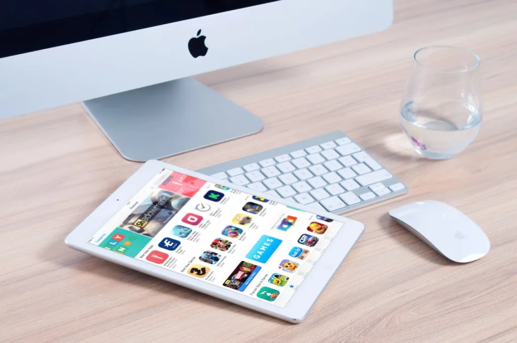
iOS app design is creating a user interface for an app that will run on Apple’s iOS operating system, such as iPhones, iPads, and other devices running iOS.
An iOS app is a software program designed to run on Apple’s operating system for mobile devices. The user interface allows users to interact with the software, consisting of buttons, menus, and other graphical elements that convey information and enable users to navigate through an app’s functions.
The goal of iOS app design is to create a user-friendly interface that allows users to interact with the app and its features easily.
Read More: Top 7 iOS Programming Languages
Tips for iOS App Design
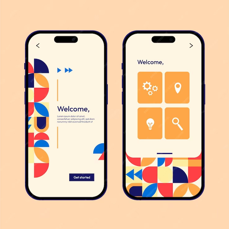
iOS app design is a challenge for many designers, but it doesn’t have to be. Here are some tips that will help you create the best possible user experience for your iOS app:
- Utilize color to show interaction
- Pick your color scheme wisely
- Typefaces: New York or San Francisco
- Keep your logo to a minimum
- Adjust your color palette for dark and light themes
- Don’t make your settings for the themes
- Use the iOS custom typography
- Pick components that make use of iOS haptics
- Observe iOS gesture conventions
- Make sure the dark theme has enough contrast
- Construct in-app navigation
1) Utilize Color to Show Interaction

One way to make your app design more intuitive is to use color to show which areas of the screen users can interact with. This can be accomplished using only one color for interactive elements and another for non-interactive elements. You could also use different shades of a single color to differentiate between interactivity or use different colors altogether.
You can also use color to show how an element will change when it is interacted with. For example, if you have a button on your screen, but the button changes its appearance when clicked, you can use the same color for both versions of the button so that users know which version they’re looking at without having to read any text or other labels on the screen.
2) Pick Your Color Scheme Wisely
The design of your app is critical to its success. If you’re not careful, you can end up with a product that looks amateur and unprofessional. Your color scheme should be picked wisely, as it can help you create an app that is professional, inviting, and approachable.
When choosing colors, think about the purpose of your app. If it’s for business use, you’ll want to choose professional and conservative colors. If your app isn’t strictly business-related, you might consider using more vibrant colors or even ones that are more playful (like bright yellow). This will allow users not looking for a strictly professional experience to feel comfortable using the app without feeling like they’re working with an outdated system.
3) Typefaces: New York or San Francisco
Typefaces are one of the most essential parts of your iOS app design. If you’re not using a typeface familiar to the user, you risk confusing them and turning them off to your application and, ultimately, your brand.
When choosing a typeface for your app, it’s essential to choose one that has been around for a while and is easily recognizable by users. This will help keep it from becoming dated quickly.
New York and San Francisco are two great typefaces used in iOS apps for years (you might recognize them from Apple’s apps). They’re also easy to read on small screens, making them ideal for an app design!
4) Keep Your Logo to a Minimum
Keep your logo to a minimum. While it’s essential to include your logo on your app, you don’t want it to take up too much space. You want your users to be able to navigate the app easily and quickly, so make sure it doesn’t take up too much space or distract from their experience.
5) Adjust Your Color Palette for Dark and Light Themes
There are two iOS app designs: a light theme and a dark theme. When it comes to colors, you want to ensure your colors are consistent across both themes. The easiest way to do this is by adjusting your color palette for each theme. For example, if you have a bright pink color in your light theme, you can use a different shade of pink in the dark theme. This will ensure that the colors remain consistent across both themes while still giving you the flexibility to differentiate between the two themes.
6) Don’t Make Your Settings for the Themes
We know, we know. You’re a designer who wants to make the most beautiful theme possible. And that’s great! We love it when our users get creative with how they use the app. But if you’re not careful, you can make an app that looks like a kindergartner designed it, and no one wants that.
Themes are one of the most essential elements of iOS design and one of the most complex. Themes are what determine how your app will look across all devices. If you choose a dark theme but create a light-colored background in one place, that inconsistency will be visible on every device.
It’s tempting to make changes here and there, but it’s better not to make your themes and follow the set criteria.
7) Use the iOS Custom Typography
If possible, use the iOS custom typography.
iOS has some great built-in typography that you can use in your app. It’s much easier to find a font you like and use in your app than trying to make sure that it looks good on every device out there. Custom fonts make your design look polished and professional. And if you’re designing for iOS, they also make it easier to keep things consistent across your screens.
8) Pick Components That Make Use of iOS Haptics
Don’t forget to make use of iOS haptics. Some people might not realize this, but when you touch the screen of an iPhone or iPad, you can feel something—and that’s called haptics. If you’re designing for iOS, you should keep this in mind when choosing components for your app.
Haptic feedback (or haptics) is a type of sensory feedback that provides information about the physical interaction between a human being and a piece of equipment. This can include the feel of a button press, the sensation of vibration, or even the sound of an alarm.
9) Observe iOS Gesture Conventions
Gestures are a crucial part of the iOS experience. They’re intuitive, they save you time, and they make your app more fun to use. But what if you could turn those gestures into something even better? What if you could make your app even more intuitive?
iOS has a lot of conventions for how users interact with their devices. As you design your app, it’s essential to observe those conventions. If users are already familiar with how they can interact with their device, they’ll feel comfortable using your app, even if it’s completely new.
10) Make Sure the Dark Theme Has Enough Contrast
This is a big one. If your design uses a dark theme, ensure that the contrast between light and dark elements is high enough that you can still see all of your content. Many app developers think they’re doing it right because they’re following all of Apple’s guidelines, but when they test their designs on real people, they realize it doesn’t work, and then they have to go back to the drawing board.
11) Construct In-App Navigation
When it comes to in-app navigation, there are a few key things to keep in mind.
First of all, make sure that you have the ability for users to navigate through your app using the same controls that you use in other areas of your app. This will make it easier for them to understand how their actions will affect where they go next.
Secondly, don’t forget about search functionality! This is one of the most common ways people find information on their phones, so if you want your app to be successful, you can’t leave out this essential feature.
Finally, consider including a “back” button so that users always know how to get back where they started. If there’s no way for them to return to the previous screen without scrolling through every single page again (which can be difficult on smaller screens), then they might give up altogether before finding what they were looking for!
Interface Essentials
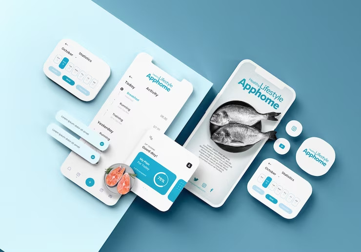
Here, we are going to be taking a look at the essentials of iOS design. Your app’s interface is a crucial part of the overall user experience. It’s the first thing your users will see, and it can make or break your app.
1) Bars
The bar is a staple of iOS interfaces. It’s used to indicate everything from the status of an app to whether or not you’re online. There are a few different types of bars:
1) Status Bar
The status bar at the top of your screen shows you information about your device, like how much battery life you have left.
2) Navigation Bar
Then there’s the navigation bar, which appears at the bottom of every screen in an app and lets you move around within it.
3) Tool Bar
Finally, the toolbar is often located at the top of an app and provides quick access to features like search and settings.
2) Views
The views in your app are what the user sees. The primary view is the one that shows up when the user first opens your app, and it can have multiple sub-views. Sub-views are each a different part of the interface that you can use to display information or perform actions, like selecting a song or selecting a filter on an image.
3) Controls
Your app is designed to be simple and easy, so you should make your controls clear and straightforward. Controls are buttons, sliders, and other things you tap or drag to make something happen. You can think of them as the user interface’s primary tools.
Best Practices for iOS App Design

Designing an iOS app is slightly different from designing a website. A few best practices can help you create an app that looks great, works well, and is easy to use.
Here are some best practices for iOS app design:
1) Minimize the Number of On-Screen Controls
In iOS app design, minimizing the number of on-screen controls is essential. This can be done by using menus and gestures instead of buttons and grouping related controls together. For example, instead of having three separate buttons that allow you to search for a product, add it to your cart, and checkout, you could have one button with an arrow in the middle of it, which opens up a menu with those three options available.
2) Keep Things Simple
Keep things straightforward. Remember that people are using their phones while walking or driving, so make sure your app doesn’t require too much attention or clicks to get what they want done.
3) Make Information Easy to Find With Little Engagement

When designing a product, it’s essential to consider how users will engage with it. If your interface is too complicated or cumbersome, they’ll be turned off and won’t want to use your app.
Don’t bury all your users’ needs in a menu or navigation bar. If information or features are not immediately accessible, make sure they are easily discoverable. Make the most important features of your app accessible from the home screen.
4) Adapt Quickly to Changes in Appearance
Adapting your app design to changes in appearance is critical to a great user experience. If you’ve followed best practices for iOS app design, you’ve already done the work to ensure your app looks great on all devices. But as Apple makes changes, you must be ready to adapt these designs so that they continue looking great.
5) Allow Interactions Supportive of How Users Hold Their Devices
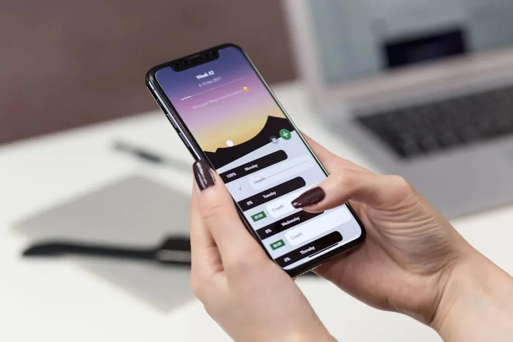
If you’re designing an iOS app, it’s essential to ensure that your app’s interactions support how users hold their devices.
Users typically set their phones down on a flat surface to interact with them when holding a phone in one hand and using it with the other hand. This means they’re looking at the device from above and interacting with it using touch gestures (usually swiping or pinching) rather than pressing buttons.
You should design your app to support these interactions by ensuring that the things you want users to do are easily accessible by swiping or pinching. You can also include buttons to perform more complex actions that aren’t as easily accessible via touch gestures. Still, these should be placed in locations where they are easy to reach when users only hold their devices in one hand.
6) Enhance the Experience Without Requesting Data Entry From Users
The best iOS app designs are the ones that enhance the experience without requesting data entry from users. This is a common mistake among app developers, who often focus on getting users to enter data rather than making their apps as intuitive and easy-to-use as possible.
It’s important to remember that if you want your iOS app to be successful, you need to make it easy for users to use it. This means ensuring that your app has all of the features it needs and that those features are intuitive and engaging enough that people will want to use them again and again.
If you’re having problems with this, try using these tips:
- Give users an easy way to navigate your app without typing anything in.
- Make sure that all of your buttons are large enough so that even if someone has big hands or isn’t very good with technology, they’ll still be able to tap them easily.
Read More: Learn to Build Human-Centered Design in 3 Simple Steps
What Size Frame Should You Use for iPhone Design?

Regarding iPhone app design, the size of your frame is everything.
It’s essential to use a frame that’s not too small or too large because this will make it hard for your users to interact with the screen. For example, if you’re designing an app that allows users to draw on the screen, then a small frame will make it difficult for them to do so. On the other hand, if you’re designing an app like Instagram or Snapchat where you want users to be able to take pictures and videos, then a large frame would be better because it would allow more space for user interaction.
When choosing your frame size, check out the competition and see what they’re doing with their apps. Once you have some ideas about what works best for each type of app (drawing apps need smaller frames than photo/video apps), try testing out different sizes yourself using mockups on graph paper before finalizing anything.
Bottom Line
In short, the future looks bright for iOS app designers and developers. Several technological advancements are sure to help people enjoy their apps even more. And as we’ve already seen, the best part is that all of these innovations will be made to work together effortlessly, which means that they should only enhance your experience as a user in the coming years.
FAQs
Can I Create an iOS App Without Spending Any Money?
You bet you can! The first step is to download Xcode and start playing around with it. You’ll probably want to check out some tutorials and guides as well; there are a lot of resources out there to help you learn how to make iOS apps from scratch. Once you’ve got the basics down, try making a simple game or app that does one thing well.
Can I Create Apps on My Own?
Yes, you can create apps on your own.
You can use the App Store to find pre-made apps that others have designed, or you can design and develop your apps from scratch. You’ll also need to learn a bit of coding, which can be tricky.
